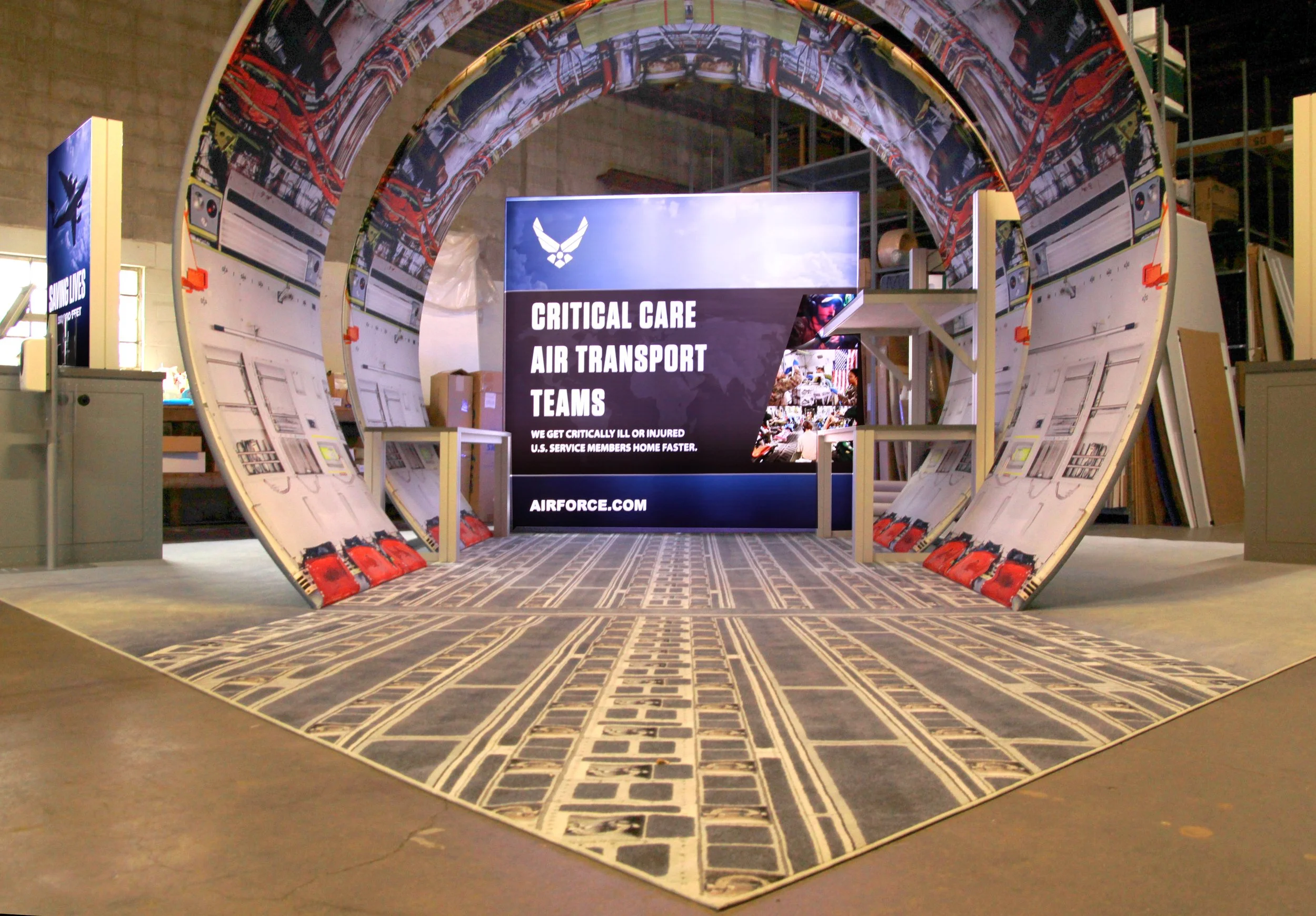
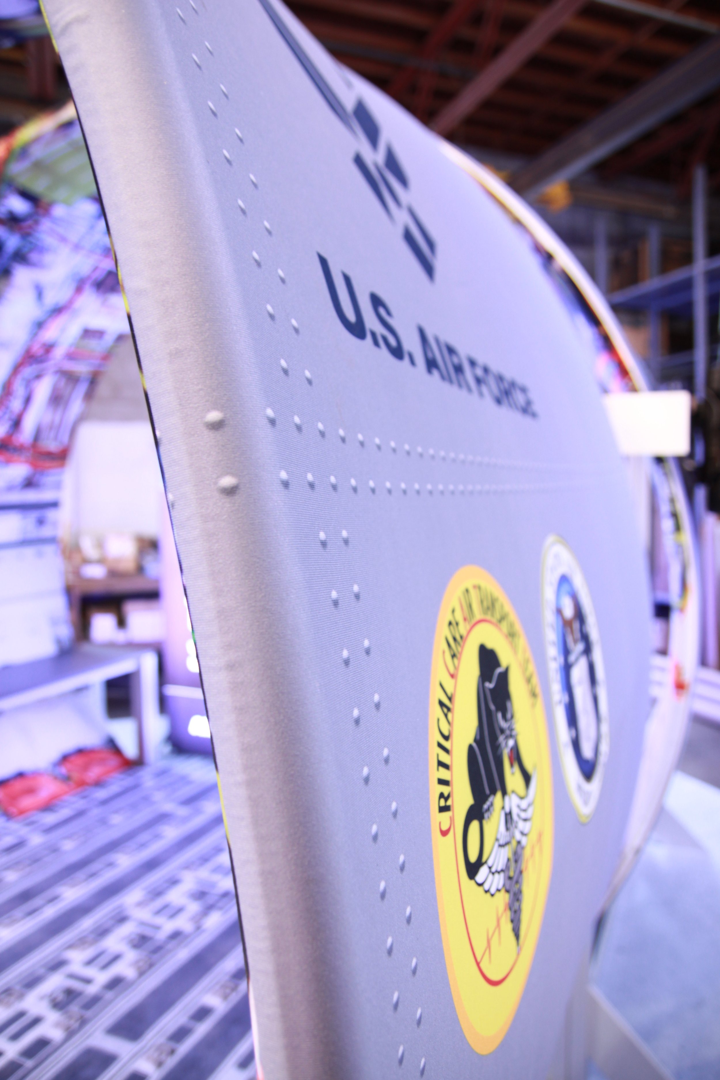
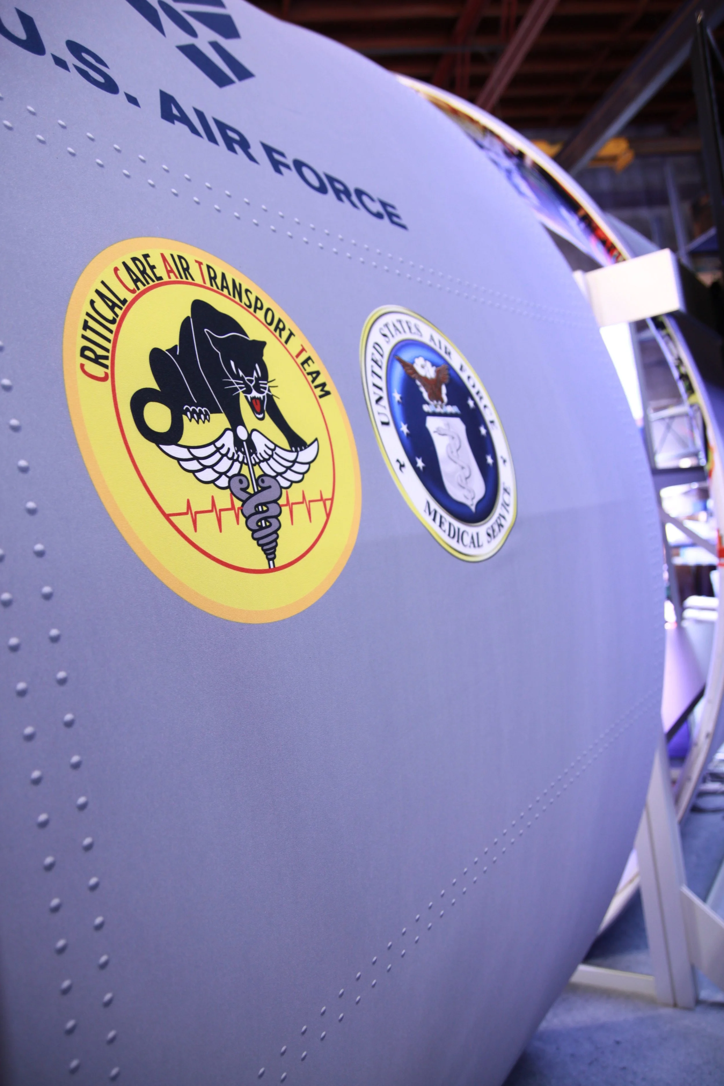
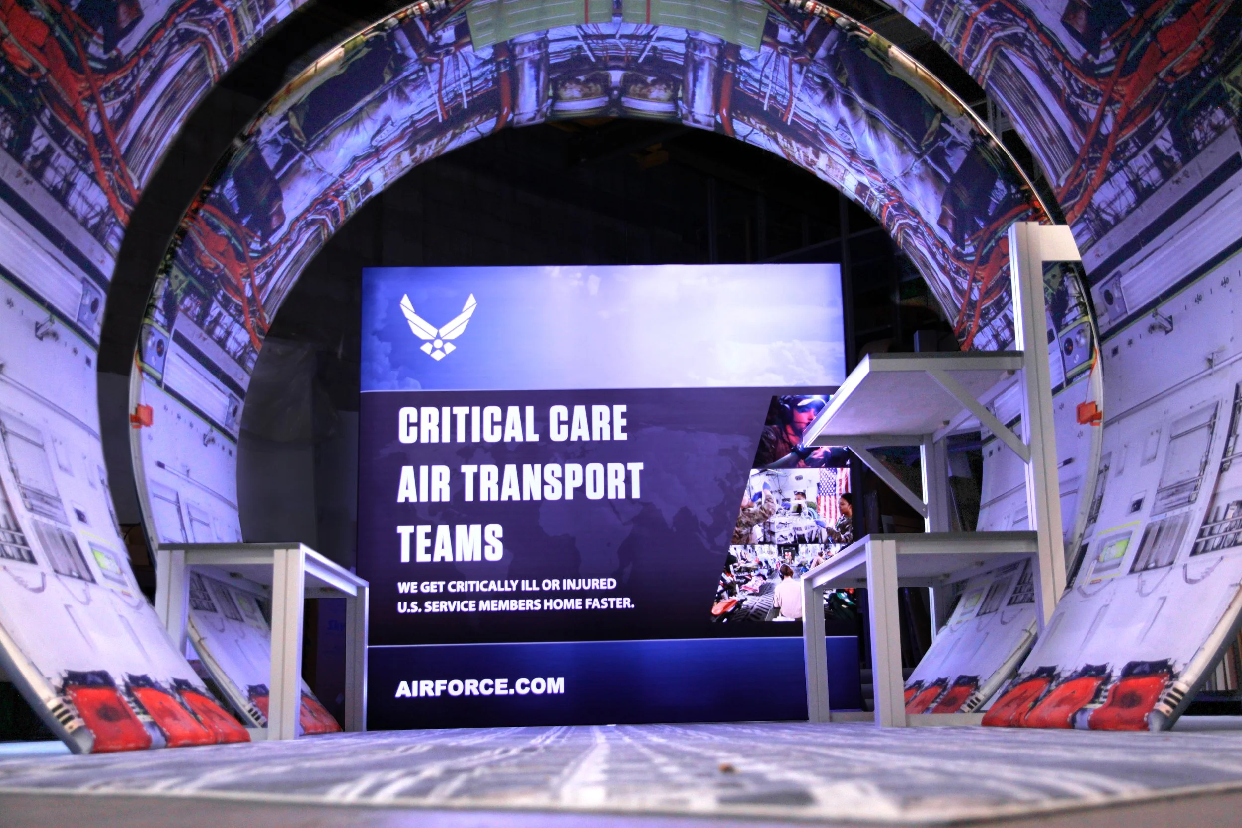
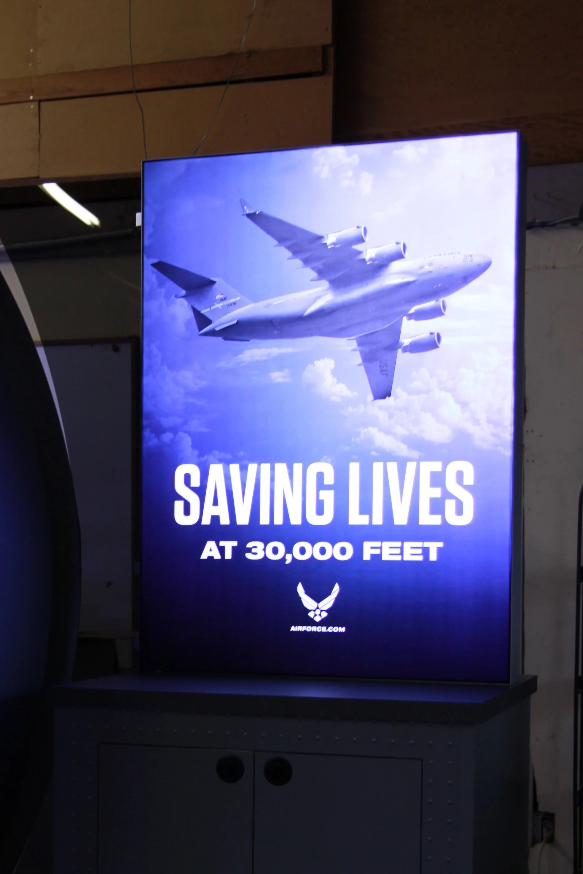
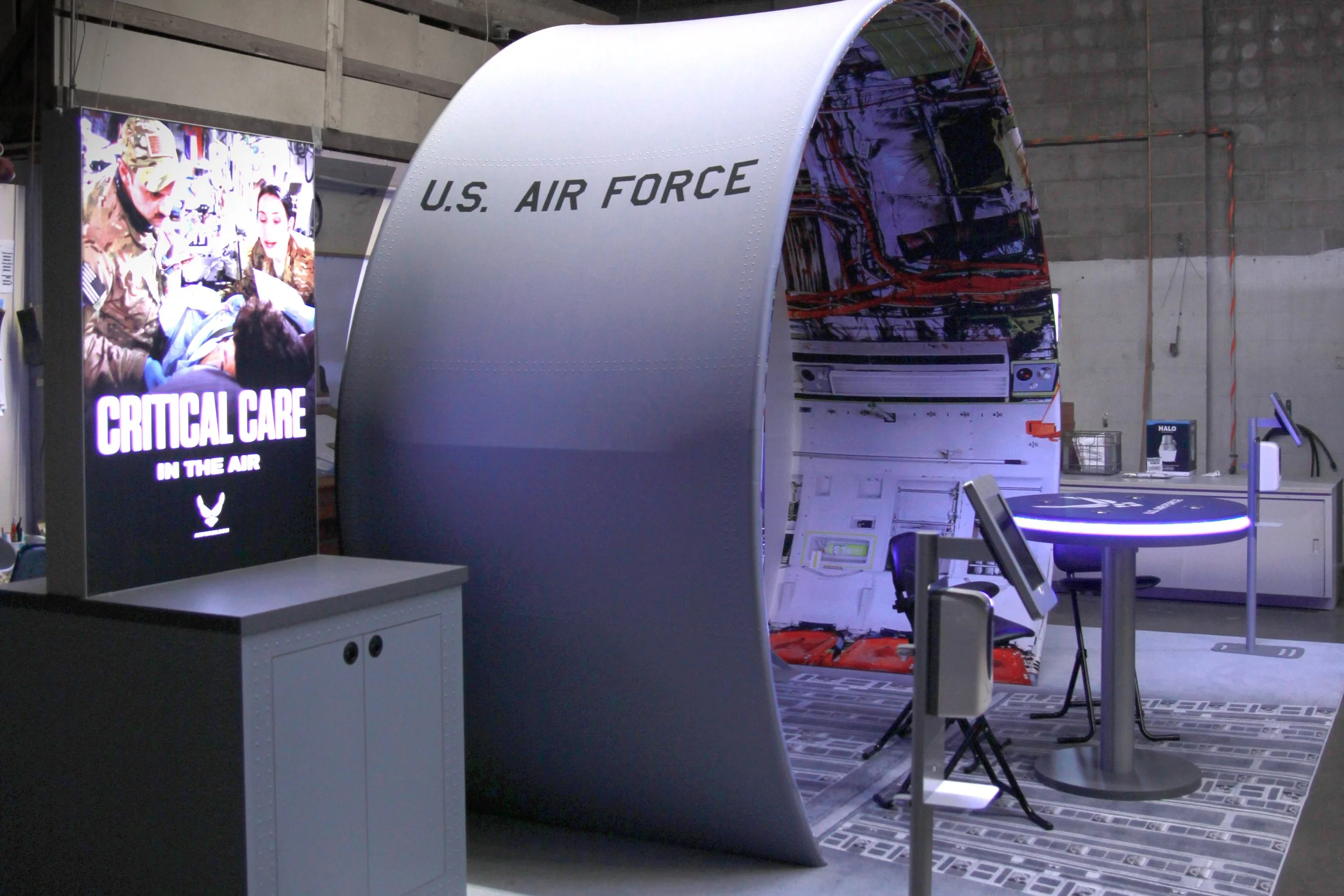
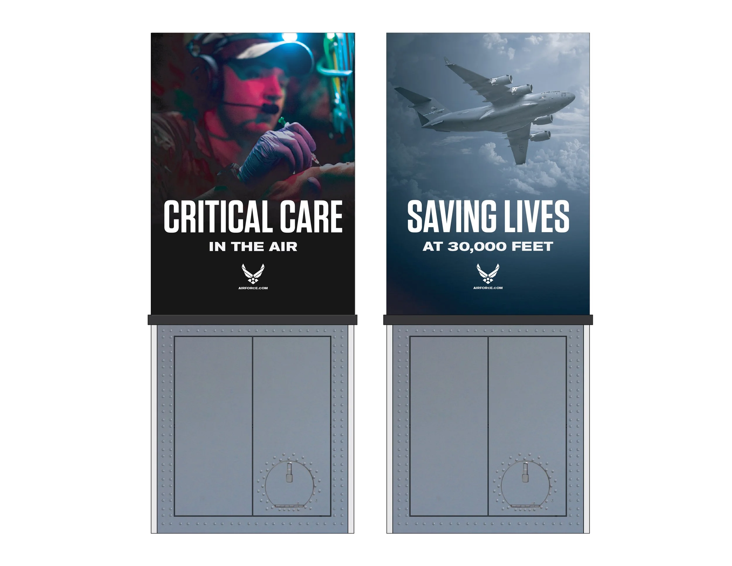
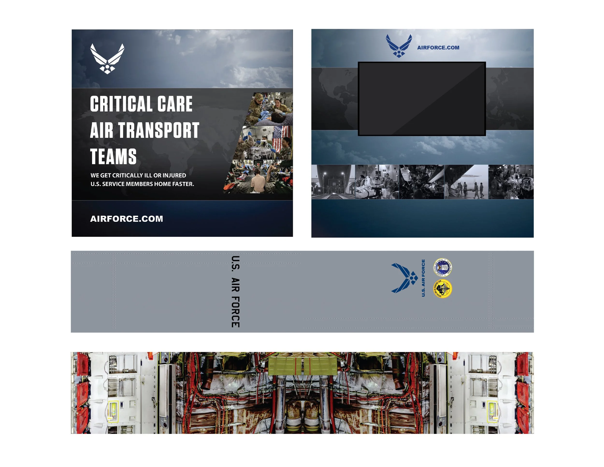
Air Force Recruiting Services was looking for a standout booth to recruit doctors into their Critical Care Air Transport Team unit. The unit specializes in reducing transport times from battlefield injuries to a hospital for care, by providing critical care in specially outfitted helicopters and planes.
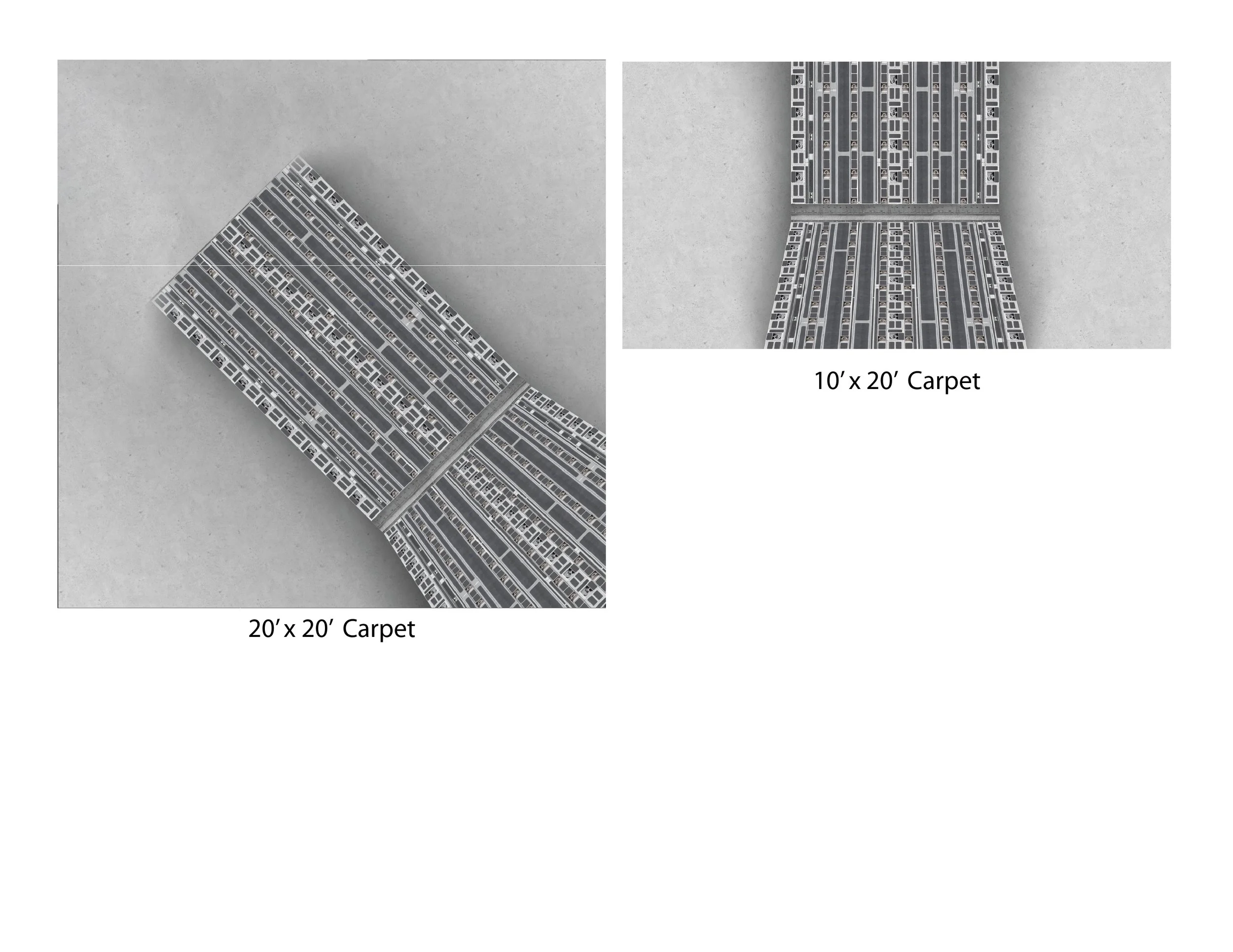
I designed a booth that could be used in 10×20 foot in-line and 20×20 foot island configurations.
The main feature of the booth is a “fuselage” that houses critical care training mannequins and a lightbox with TV that rolls video footage describing the day-to-day CCATT operations.
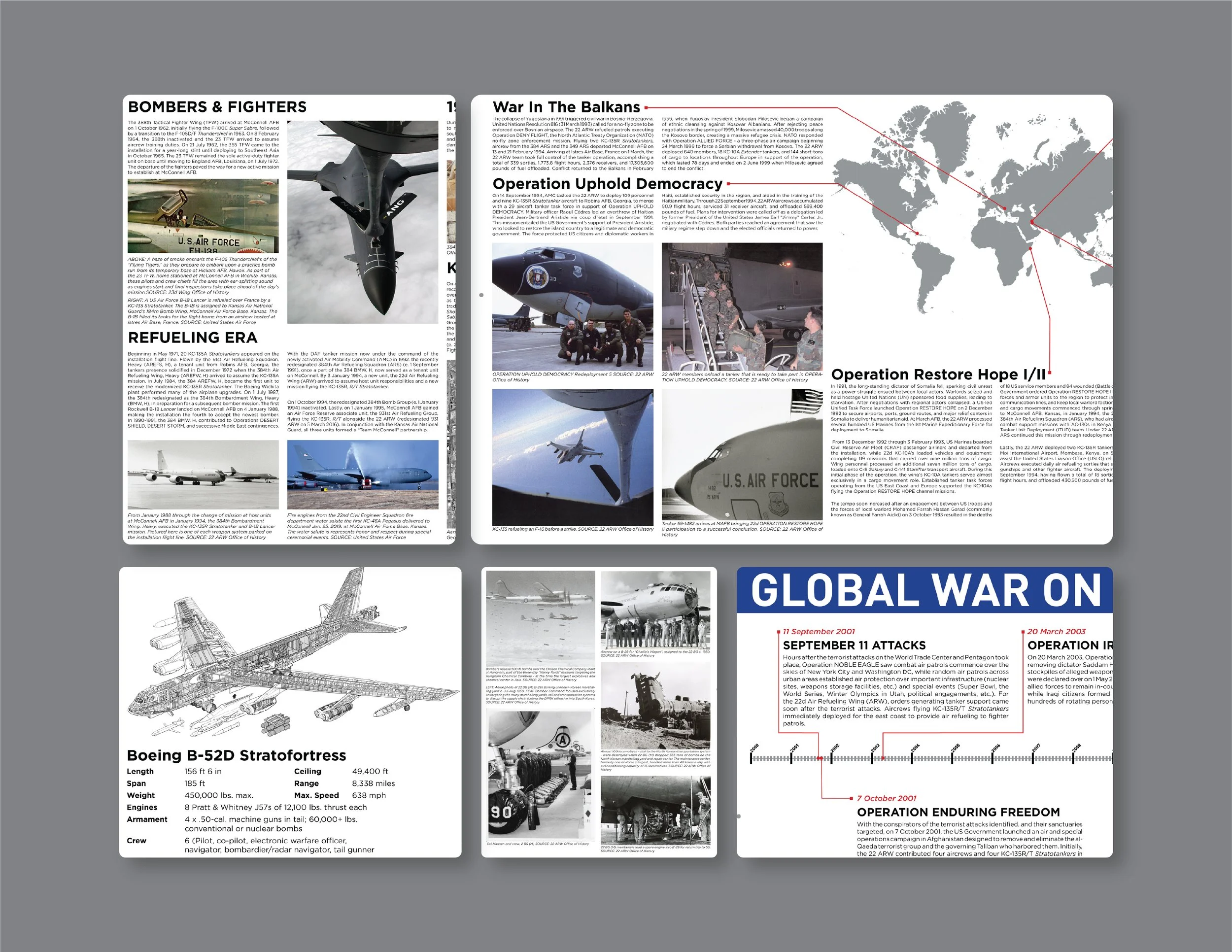
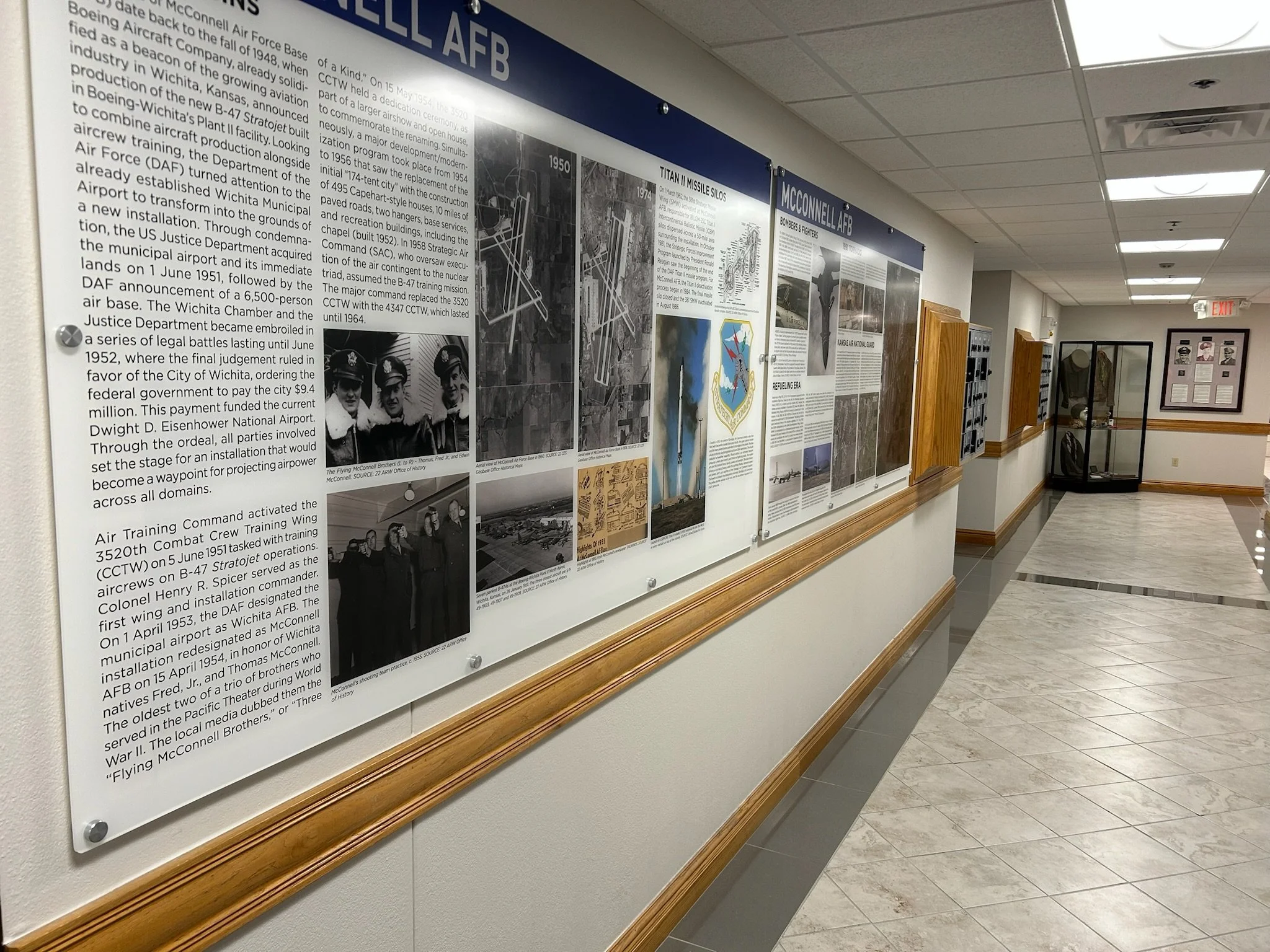
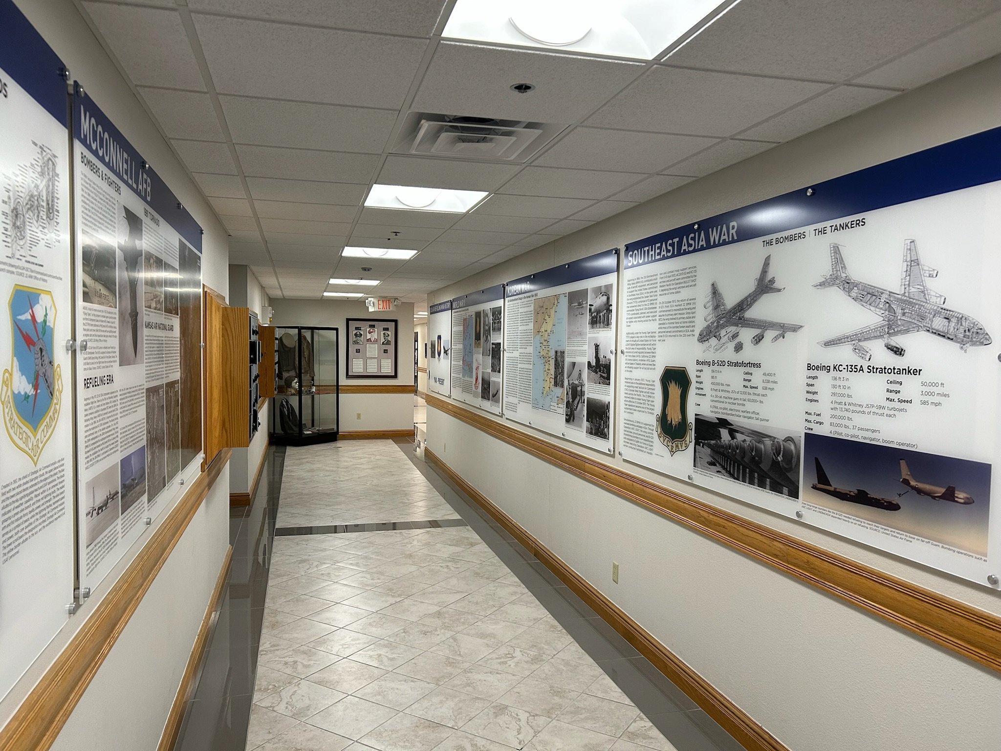
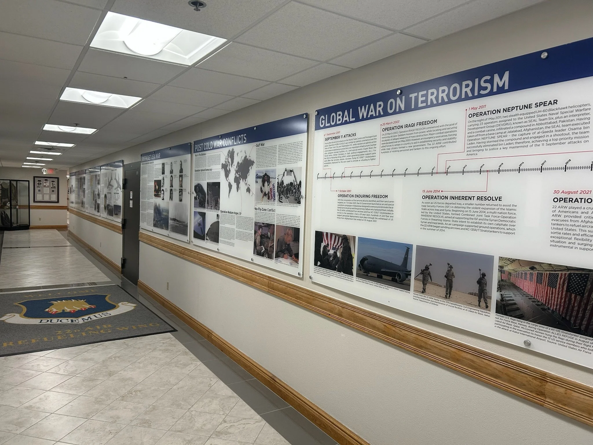
To celebrate 75 years of McConnell Air Force Base, I designed a series of 9 panels to tell the story of the Base’s history and the units who have stationed at and deployed from McConnell AFB. The panels are on display at the base.
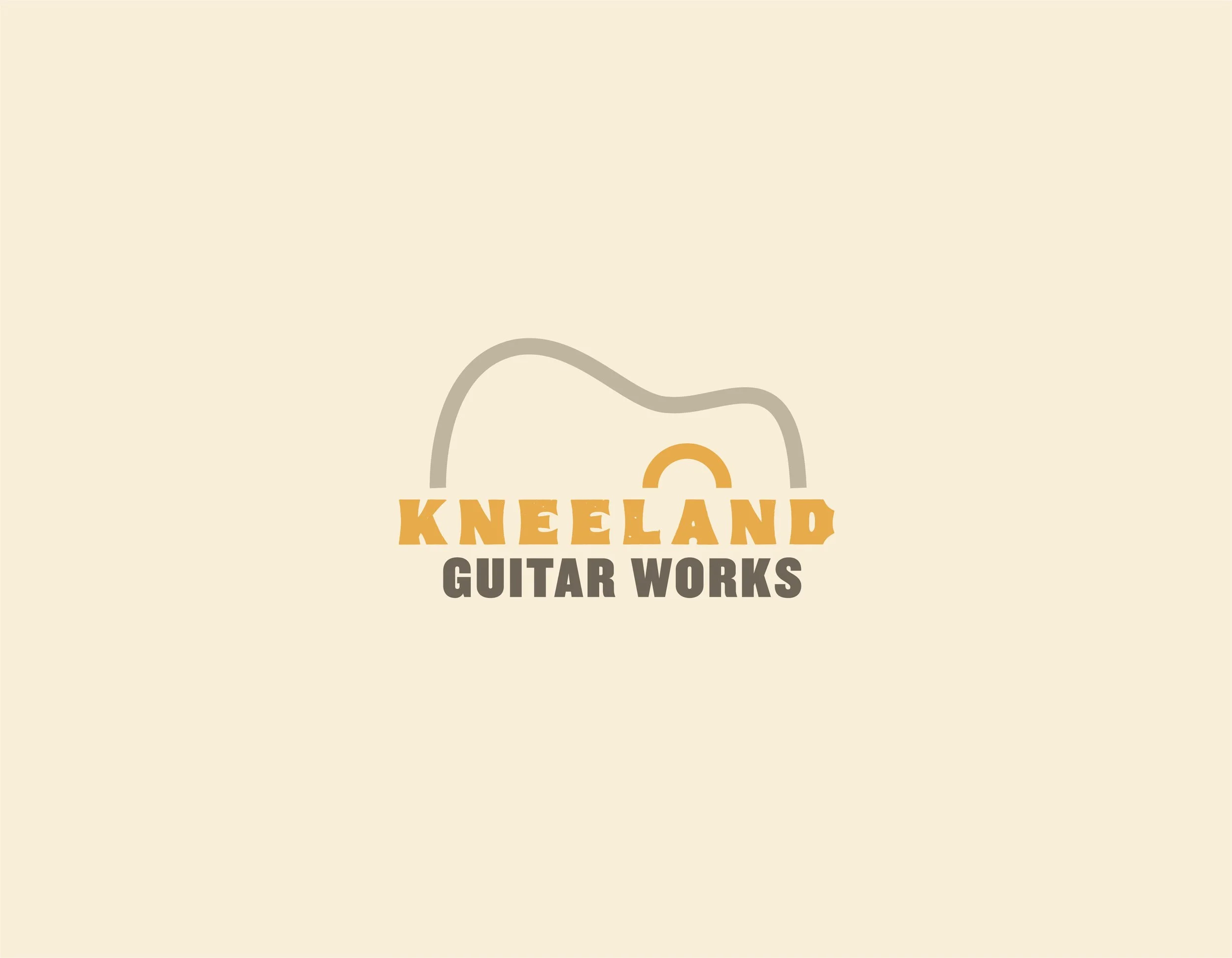
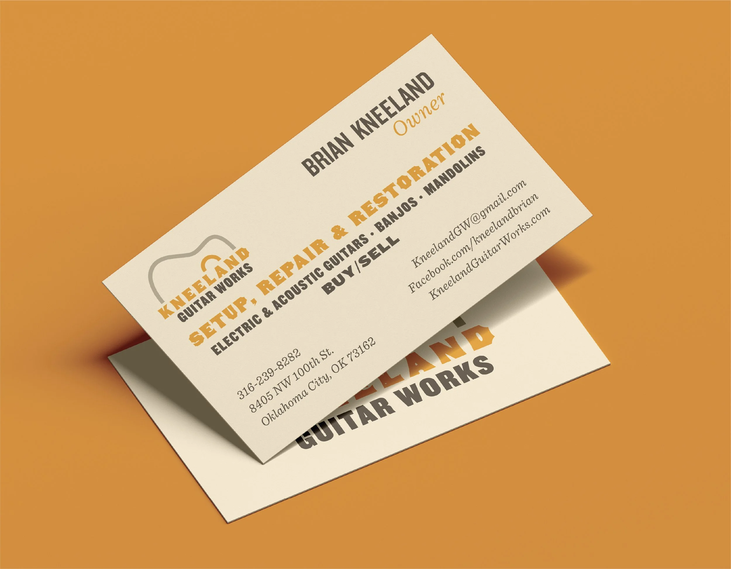
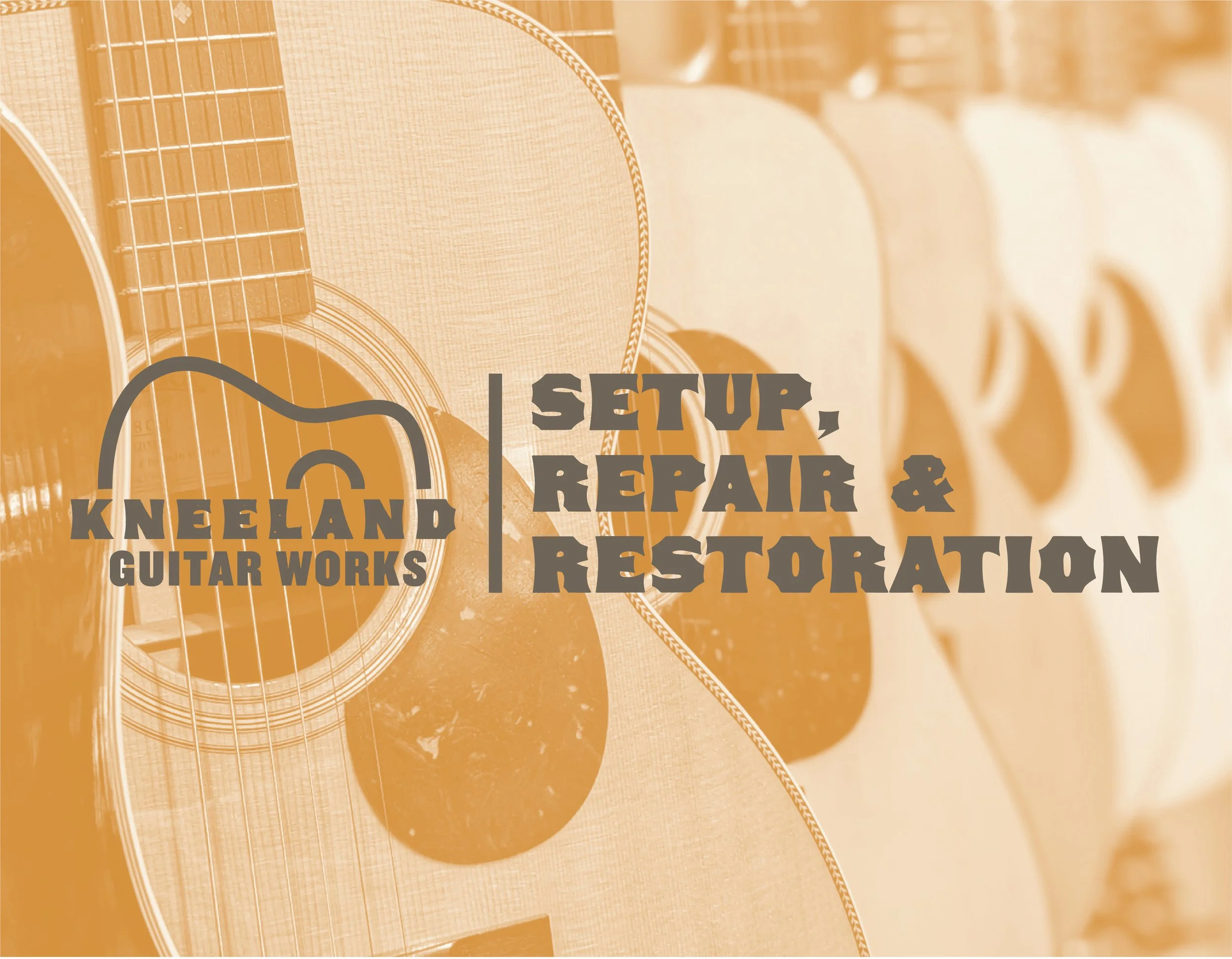
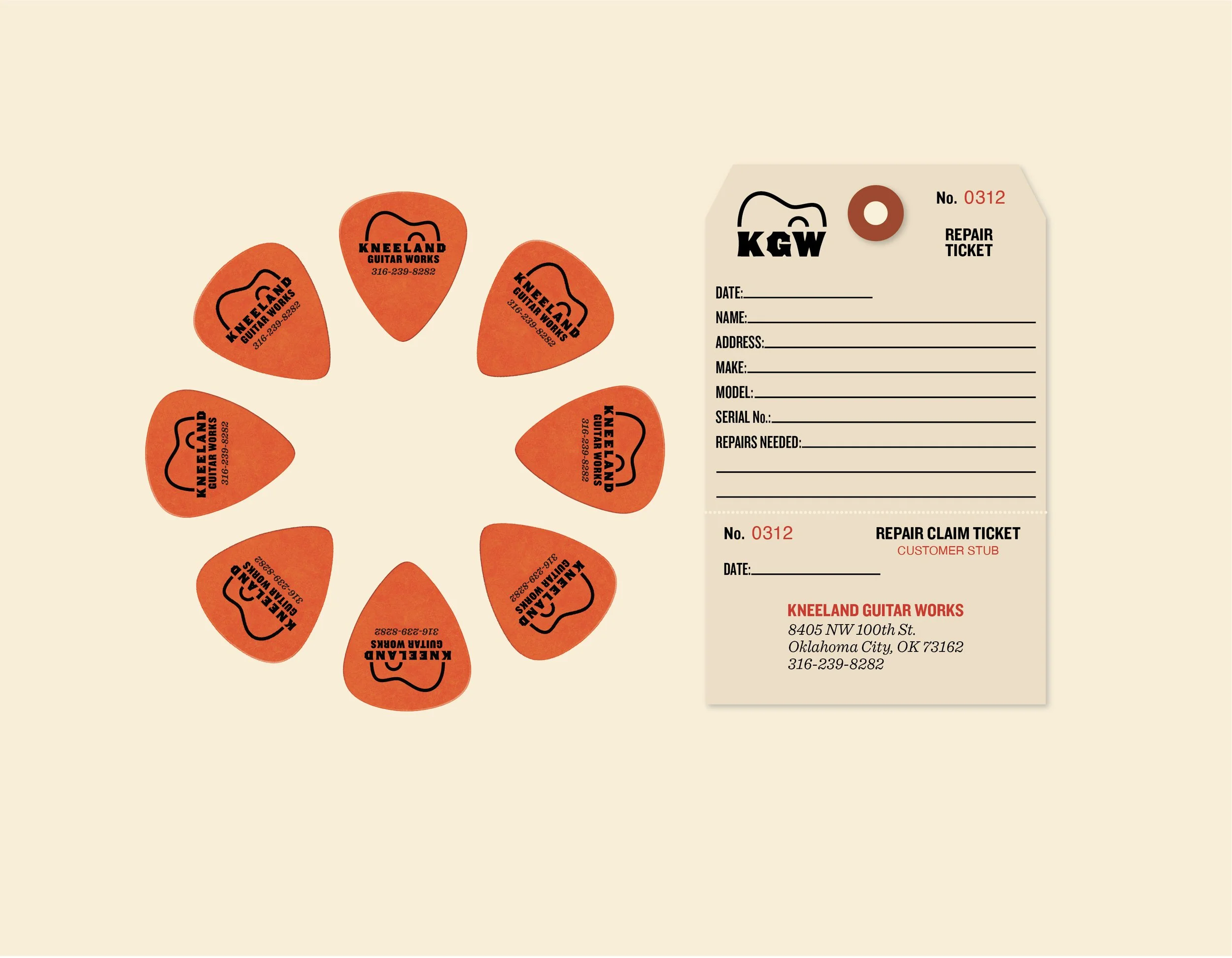
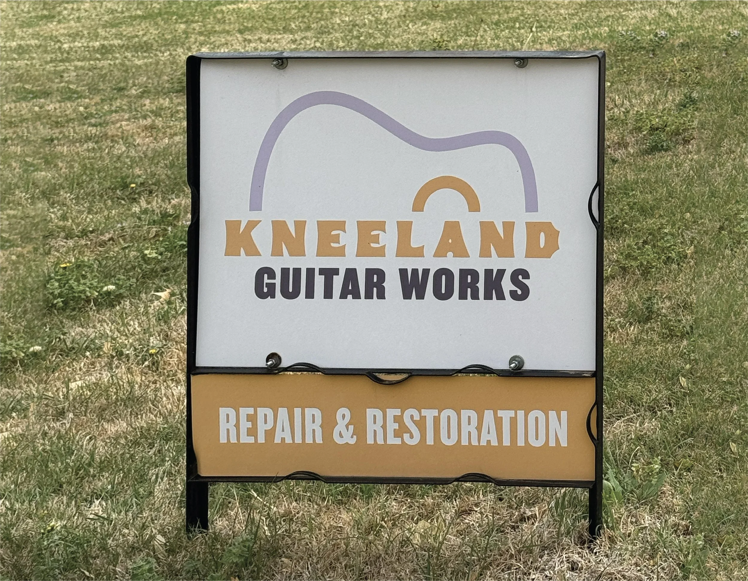
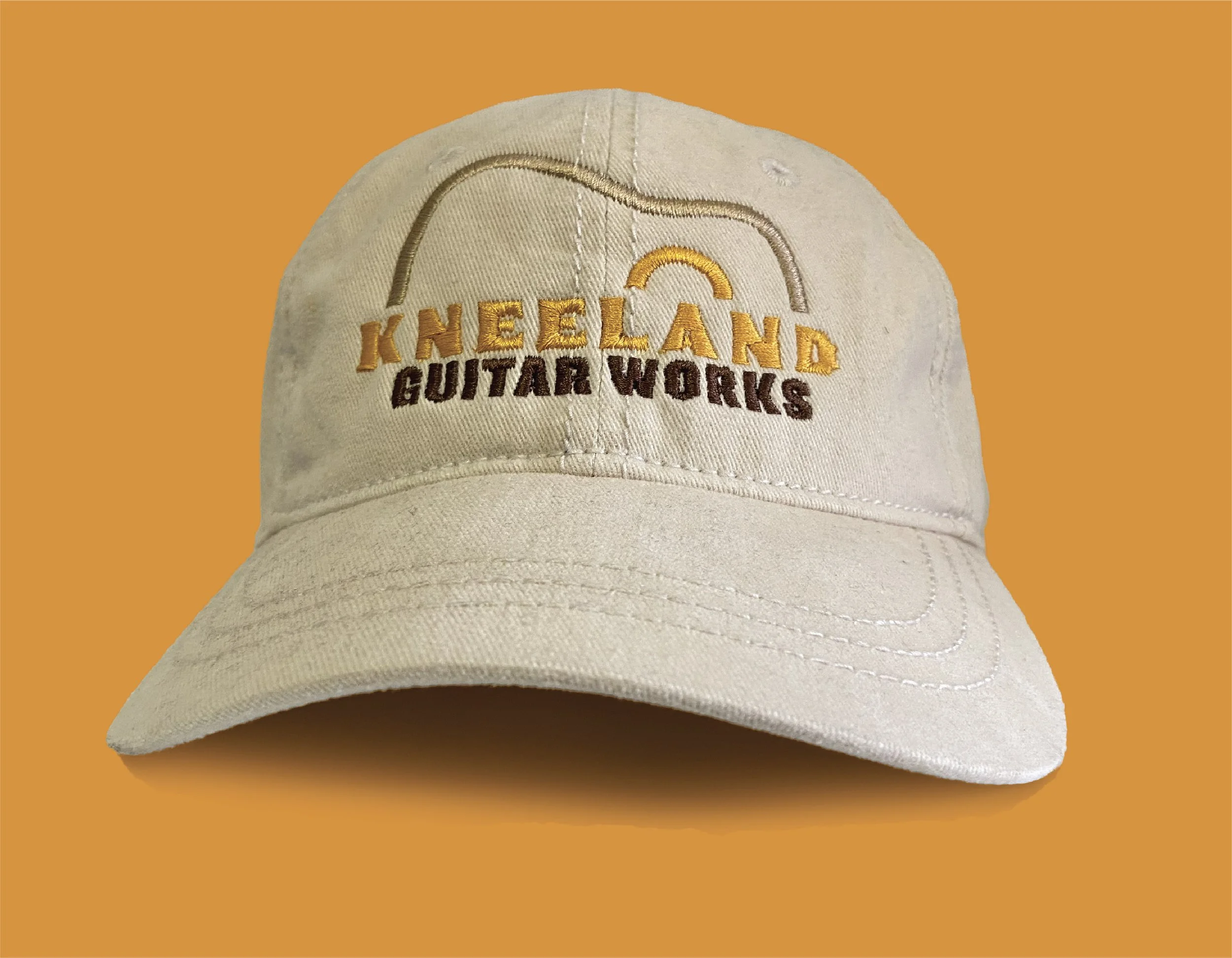
Brian Kneeland of Kneeland Guitar Works came to me for a refresh on his logo. We developed a new look, a set of fresh business cards, yard signage, repair tickets, and some swag for his customers.
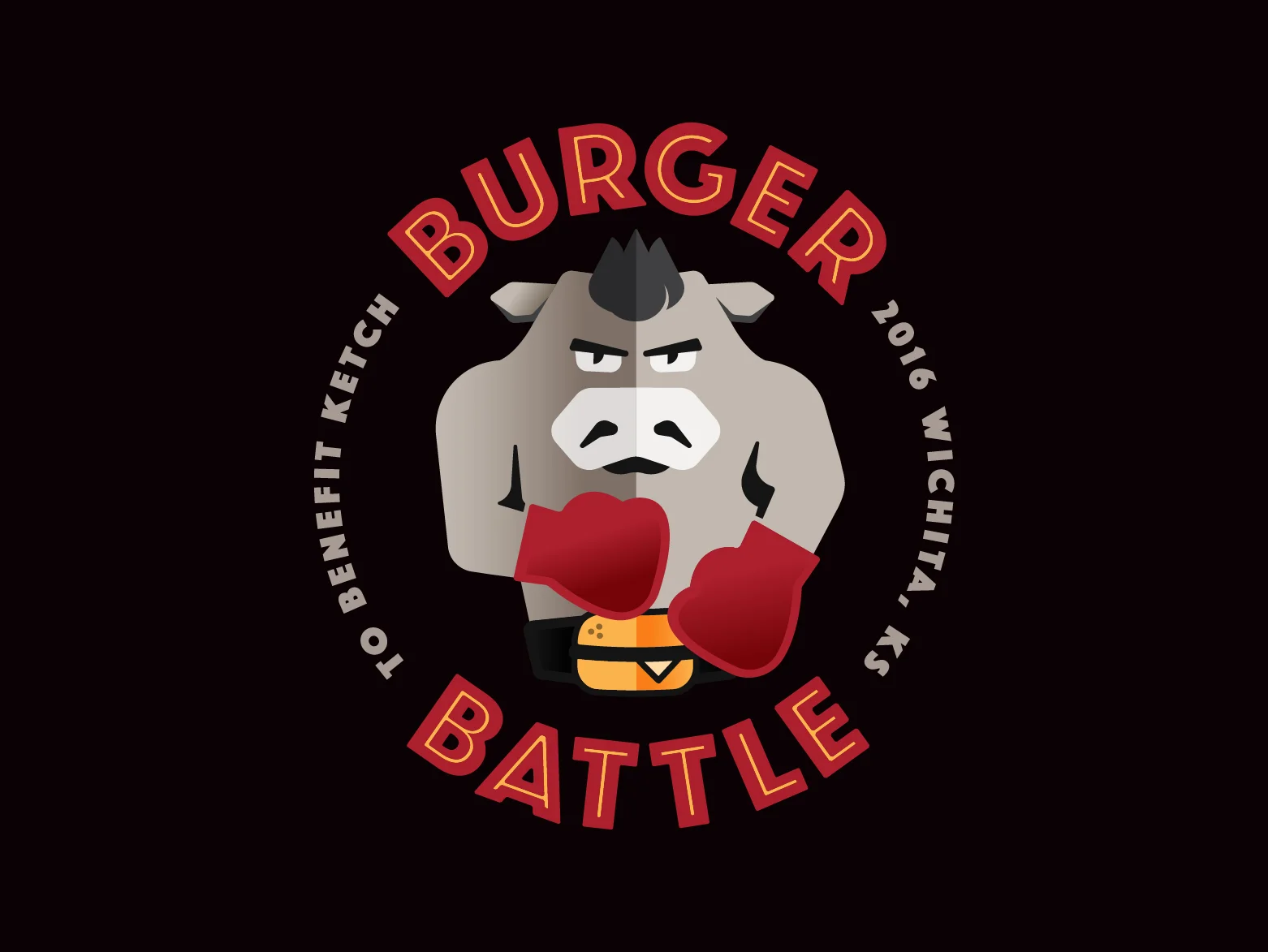
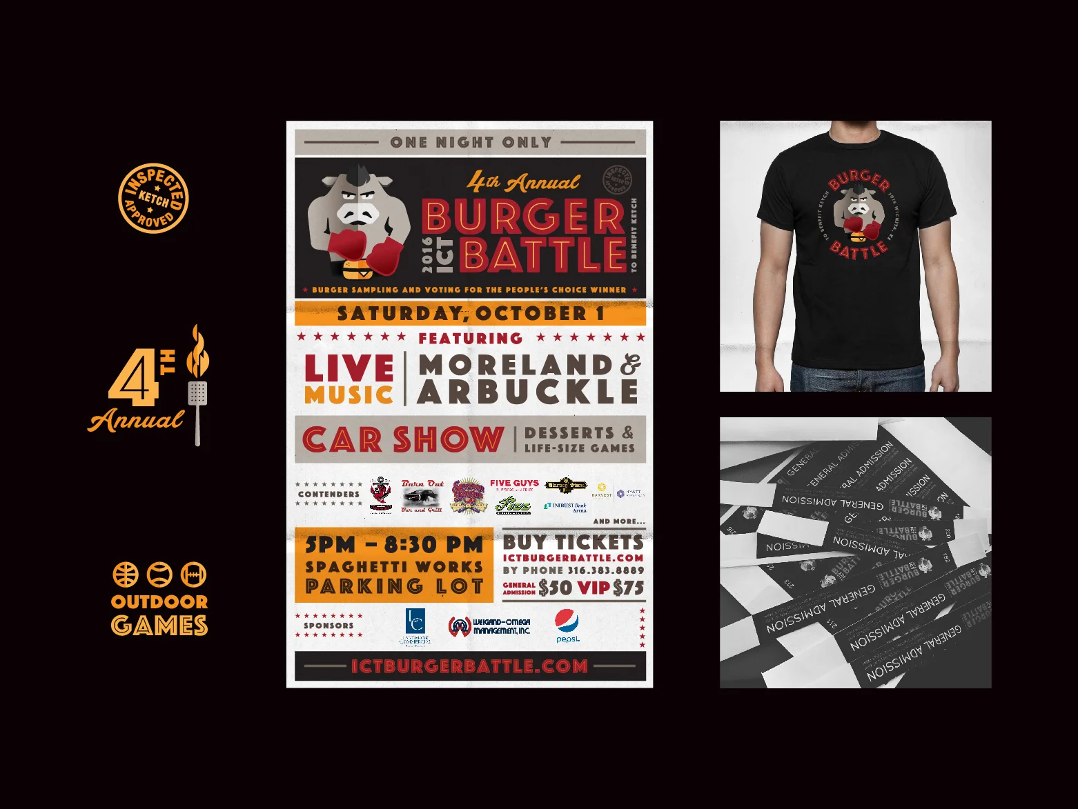
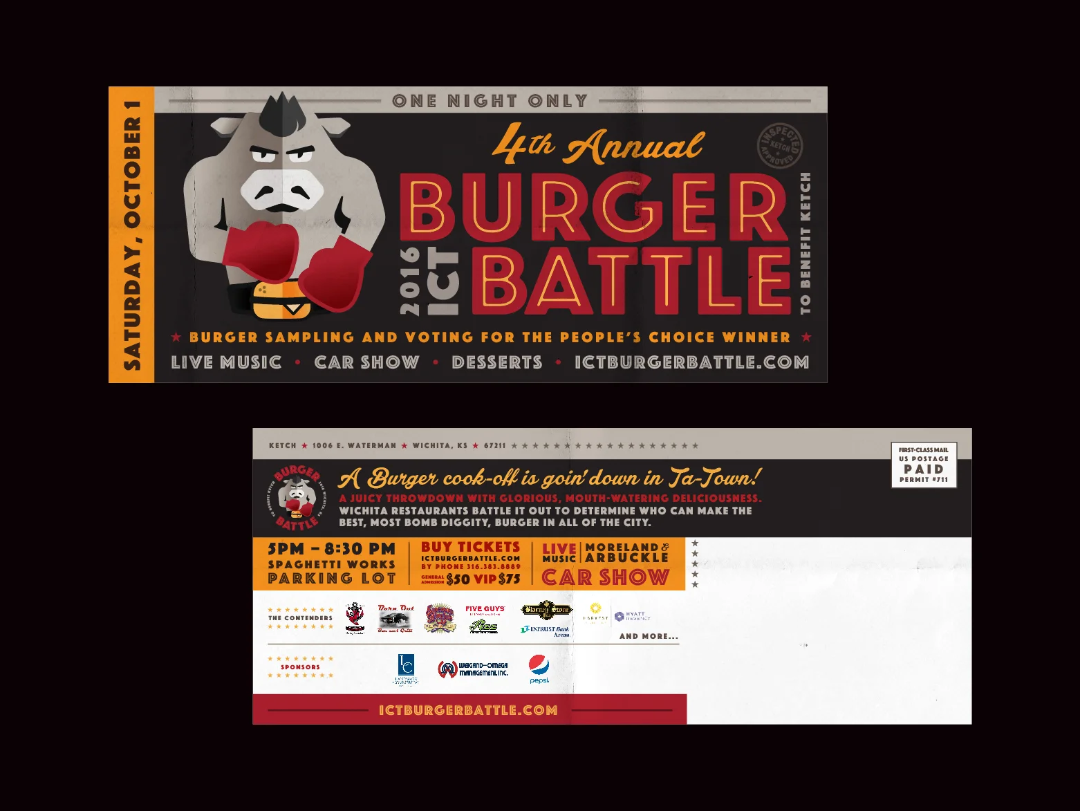
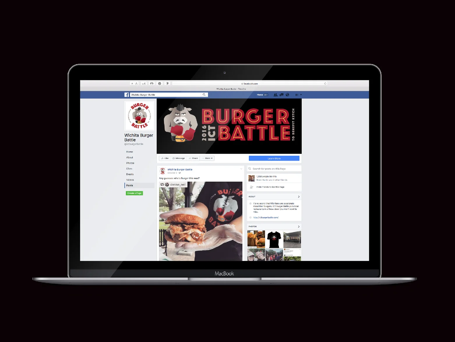
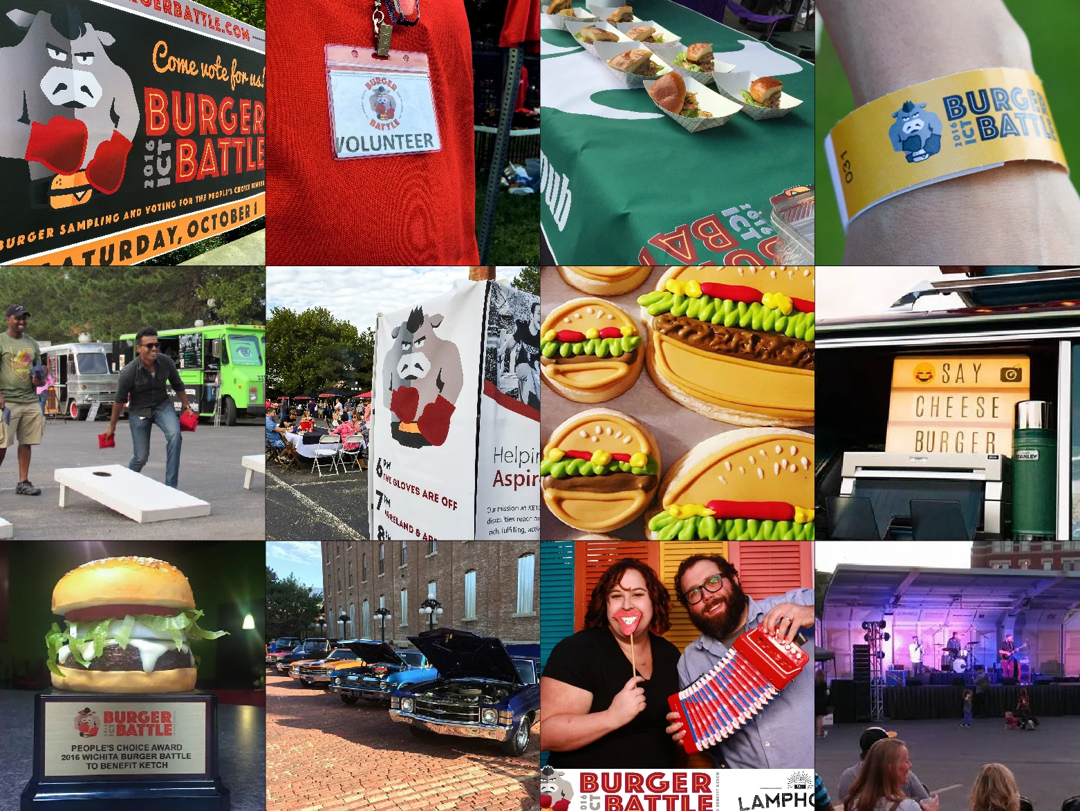
Ketch was looking to freshen up their identity for the 2016 Burger battle, so we developed a mark to liven up the proceedings. We tried to get to the spirit of what Burger Battle is all about: The best burgers in town battling it out for top honors!
Proceeds from the event raise money to benefit the programs they provide to help disabled Kansans live and work in Wichita.
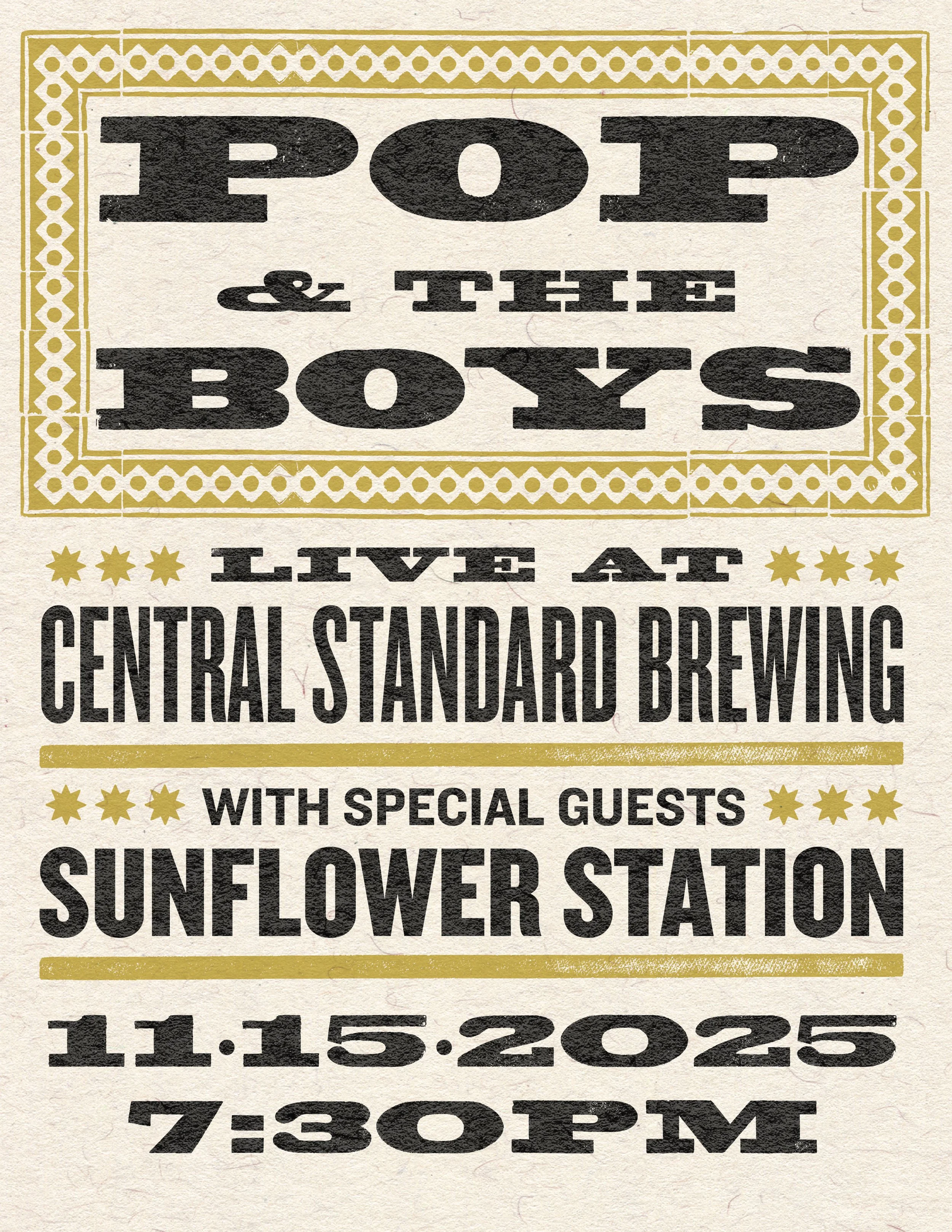
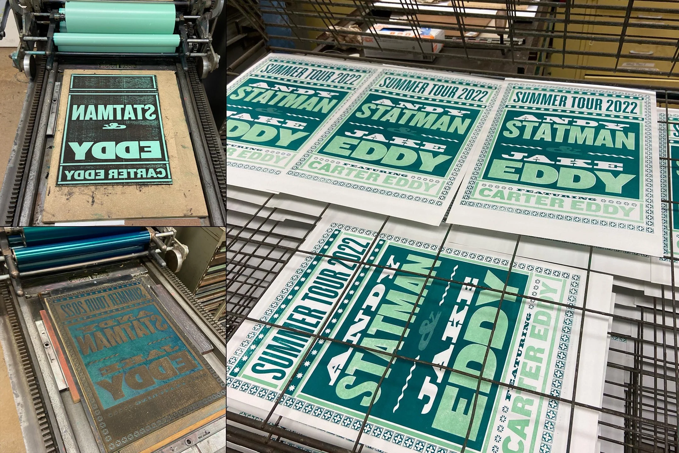
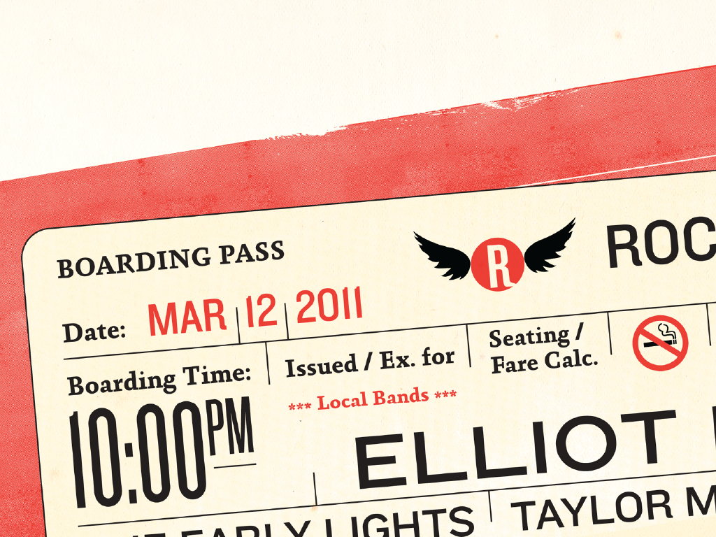
Show posters and album art are the two things that initially led me to graphic design as a career. As a lover of live music, I take any chance I get to design and produce show posters. Whether I’m producing letterpressed or screen printed posters or digital posters for a facebook event, I love it all!
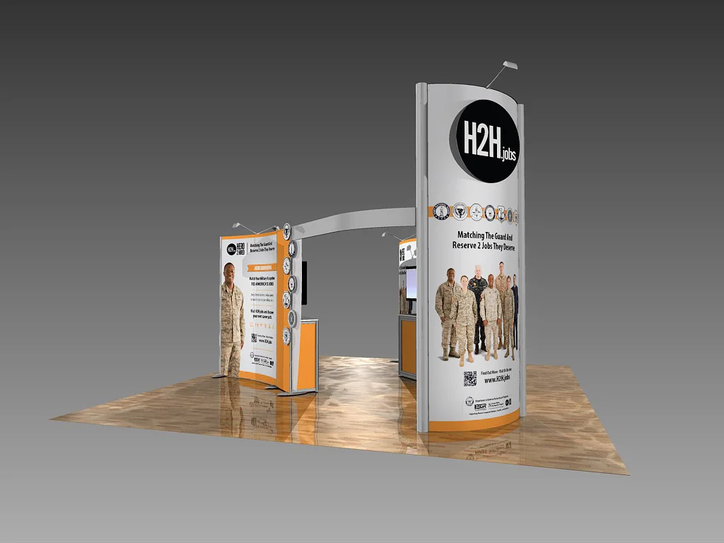
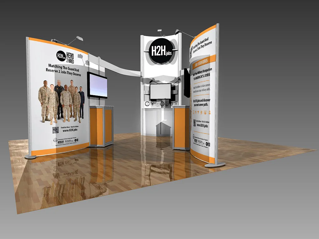
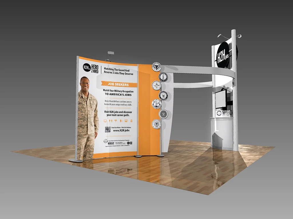
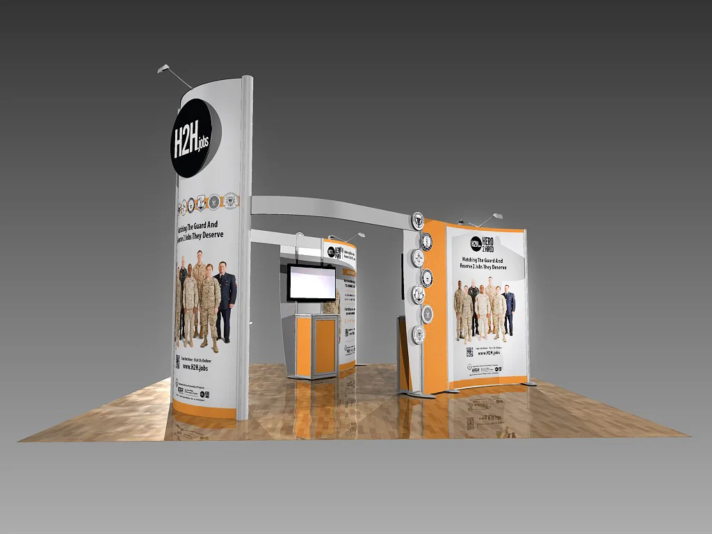
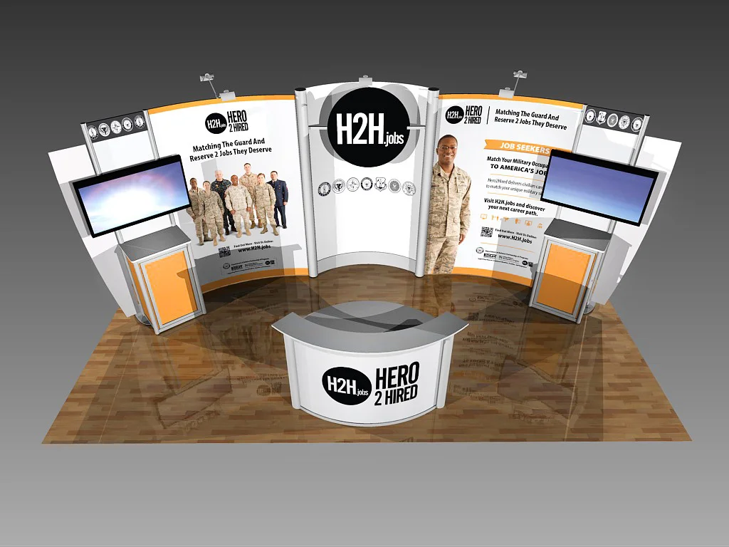
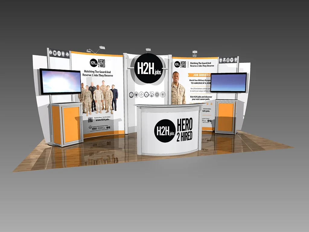
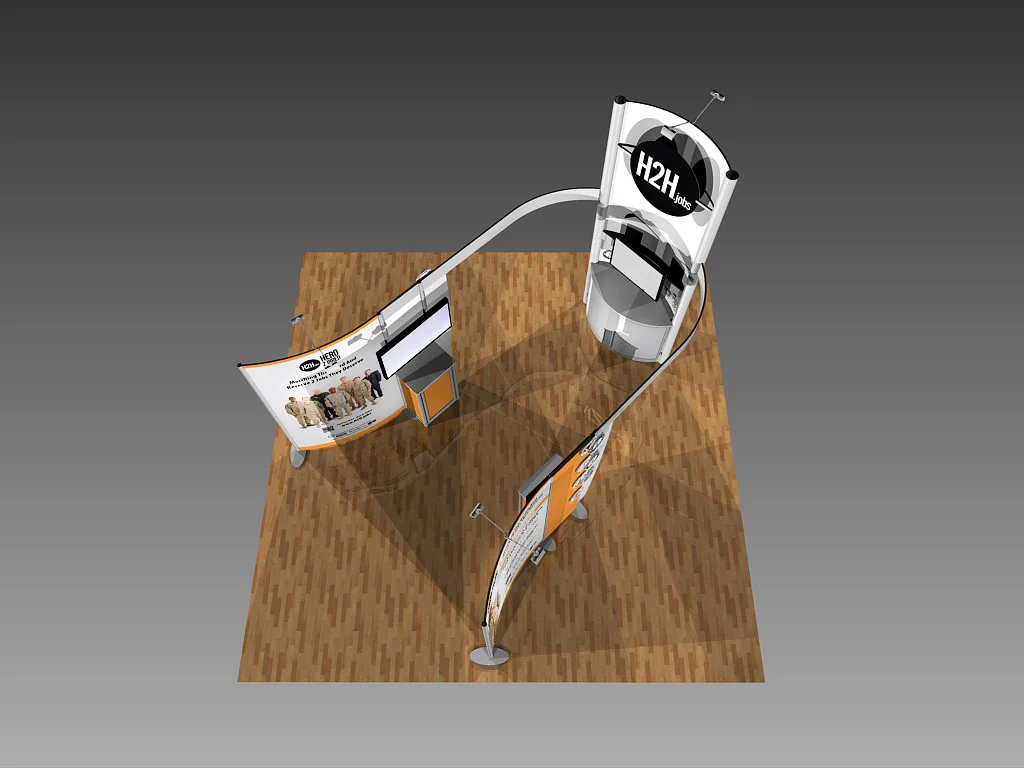
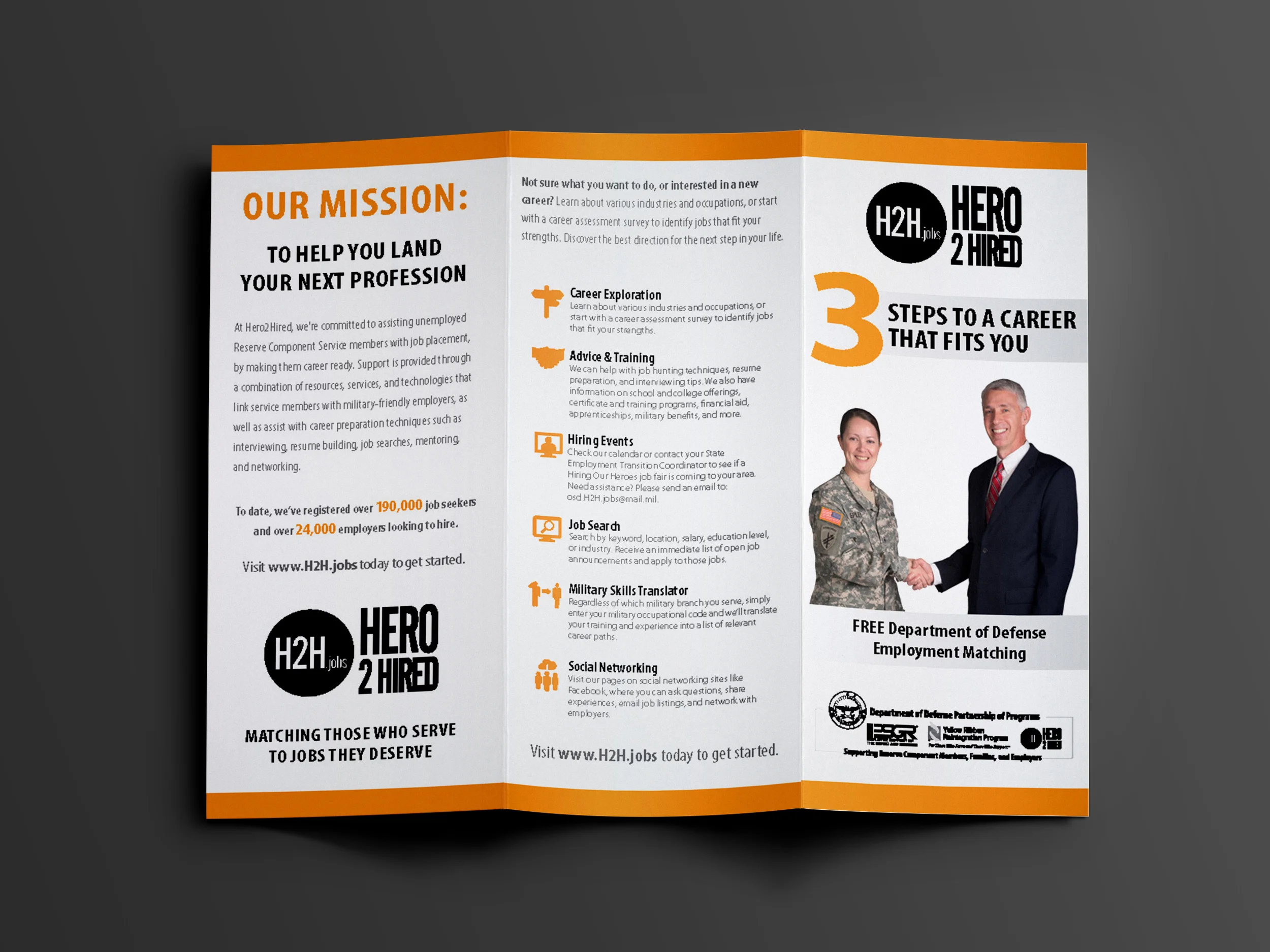
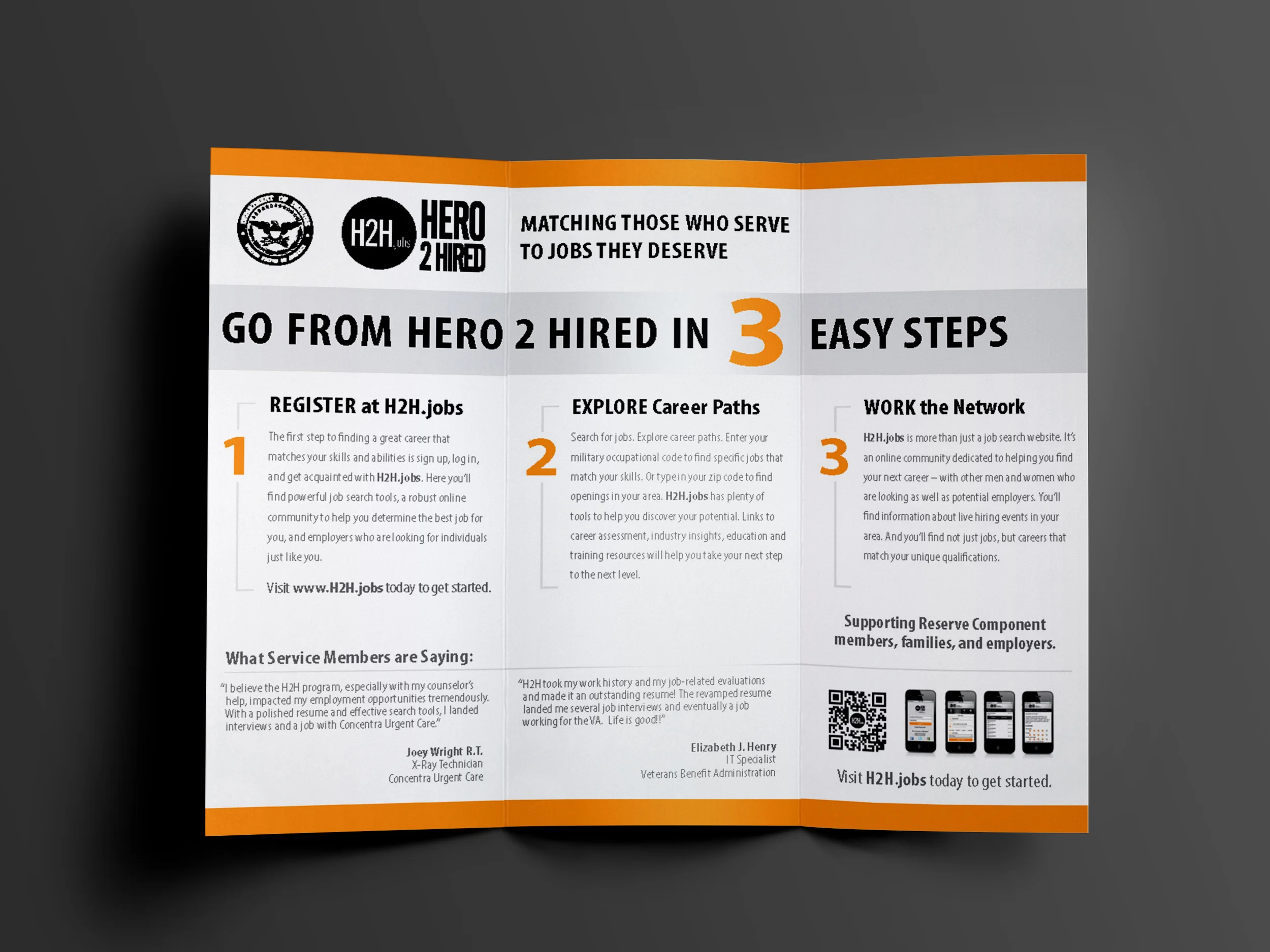
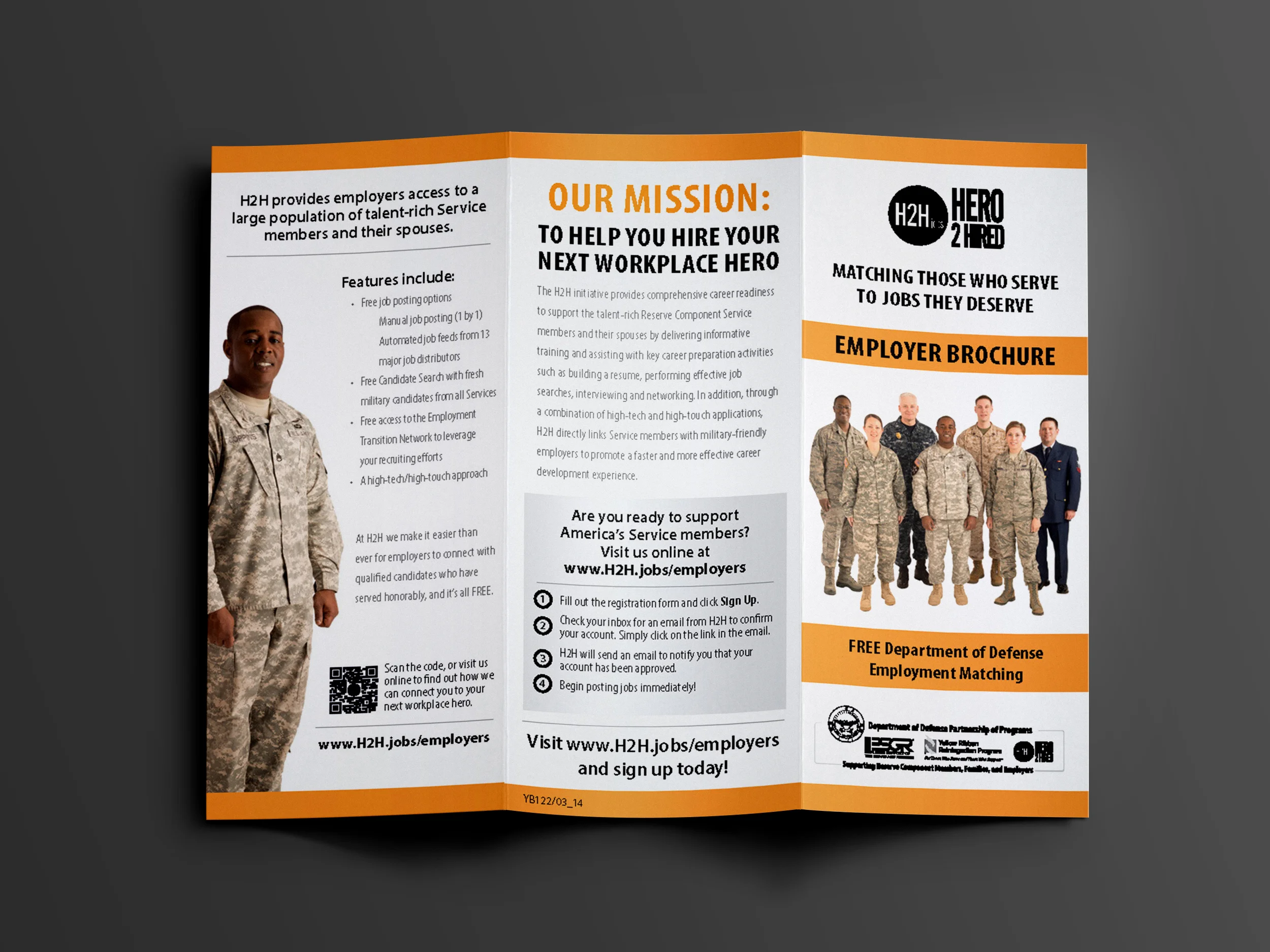
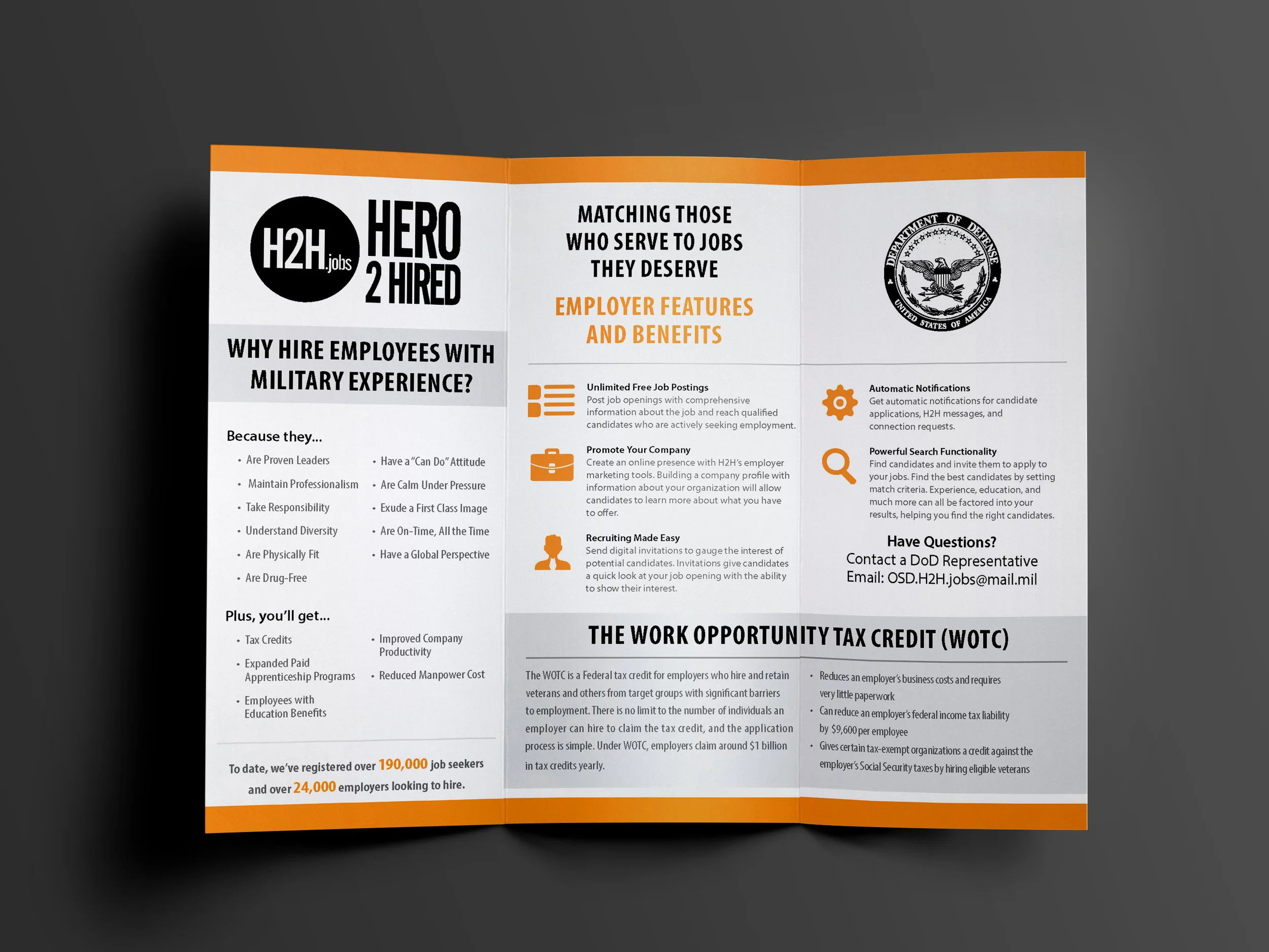
I designed a suite of trade show materials to support H2H's mission to reduce unemployment rate among our Nation's Guard and Reserve Members.
H2H was looking for a versatile solution on a budget. We designed the booth on a convertible frame to give the client the option to set the booth up in a 20x20 or a 10x20 configuration.
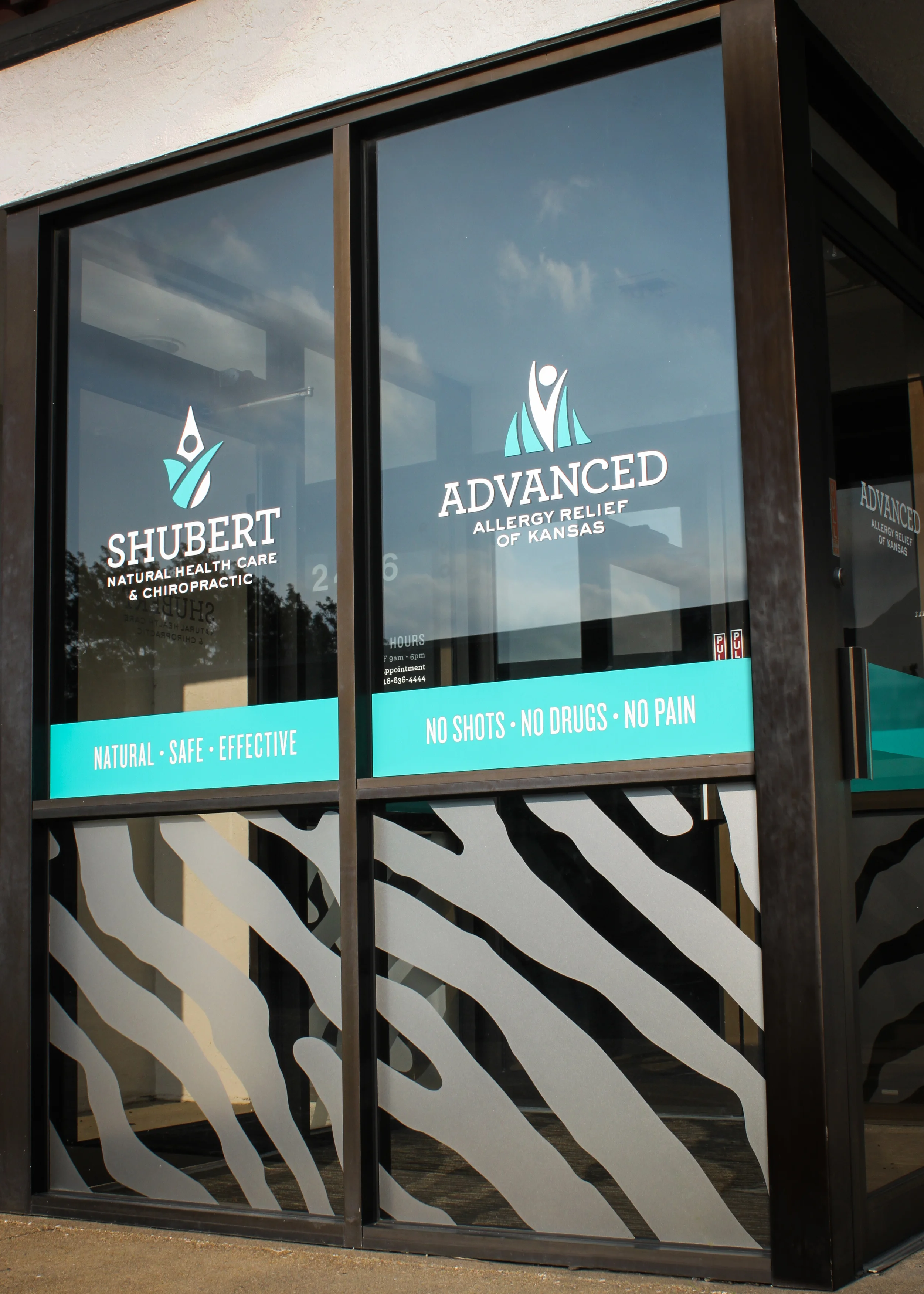
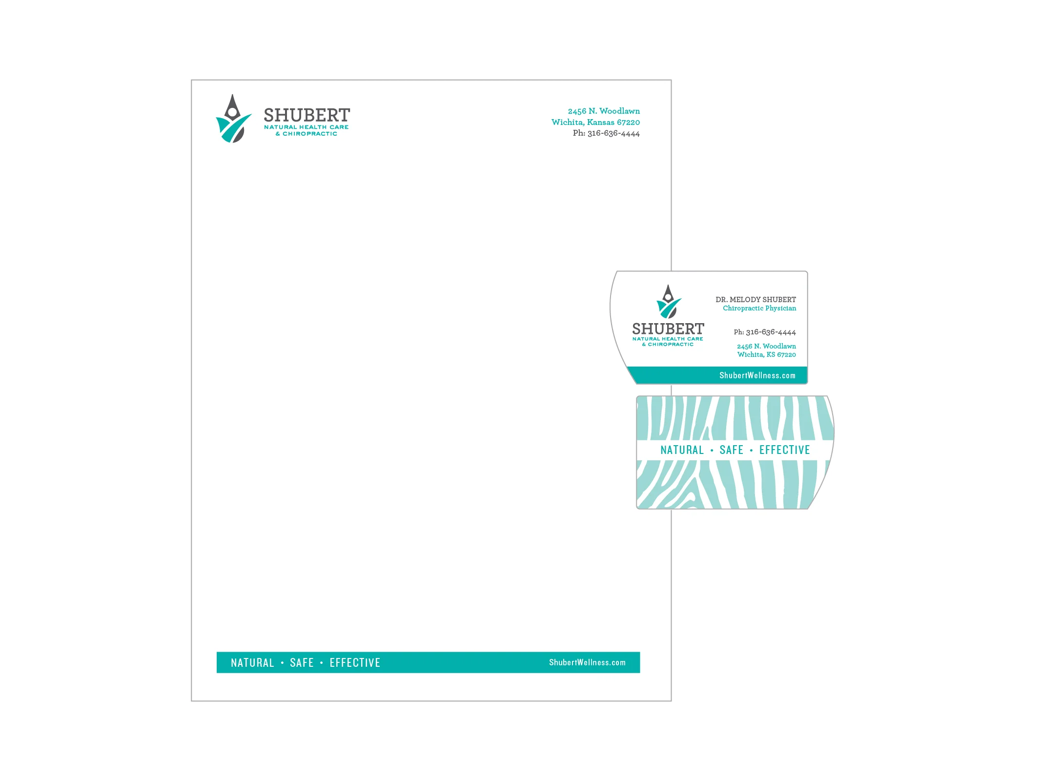
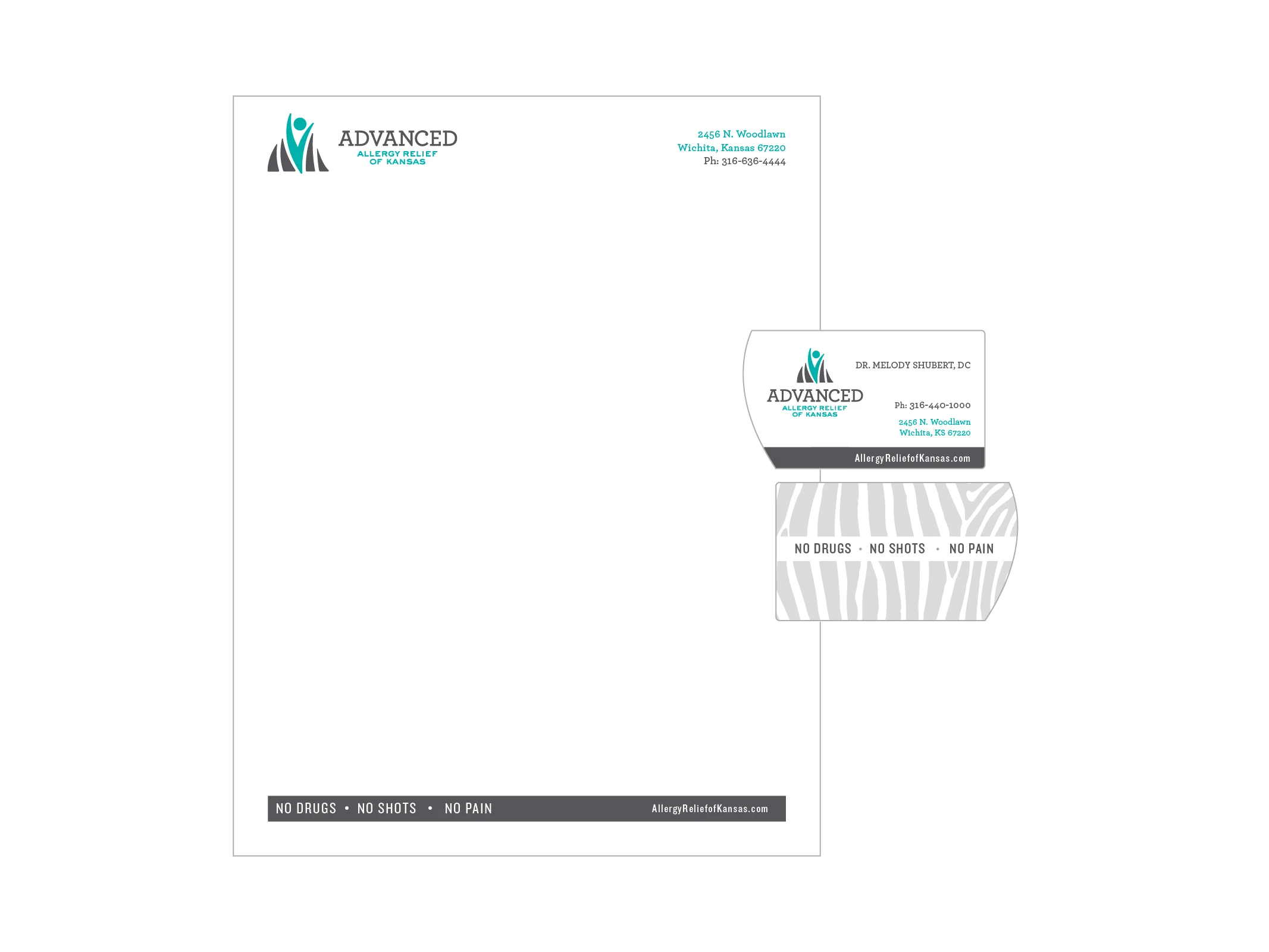
Dr. Melody Shubert focuses on natural, holistic health practices. She was looking for a rebrand to differentiate two sides of her practice. We worked to create two identities that were distinct, but related and to show the power of natural holistic practices.
We designed a full range of materials including business cards, letterhead, and building signage.
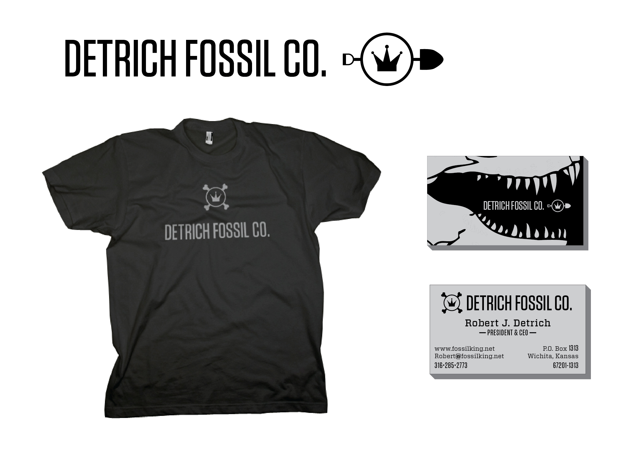
Bob Detrich is known as "The Fossil King" and for good reason–in addition to discovering the most complete T-Rex ever found, Bob has made a wide range of exciting pre-historic finds including Triceratops, a baby Tyrannosaurus Rex, and even a Mosasaur which hangs in the Kansas State Capitol Building.
I worked with Bob to update his mark and his business cards to represent Bob's energetic and fun personality. We played off his nick name and worked to highlight his most famous discoveries in a playful, but professional way.
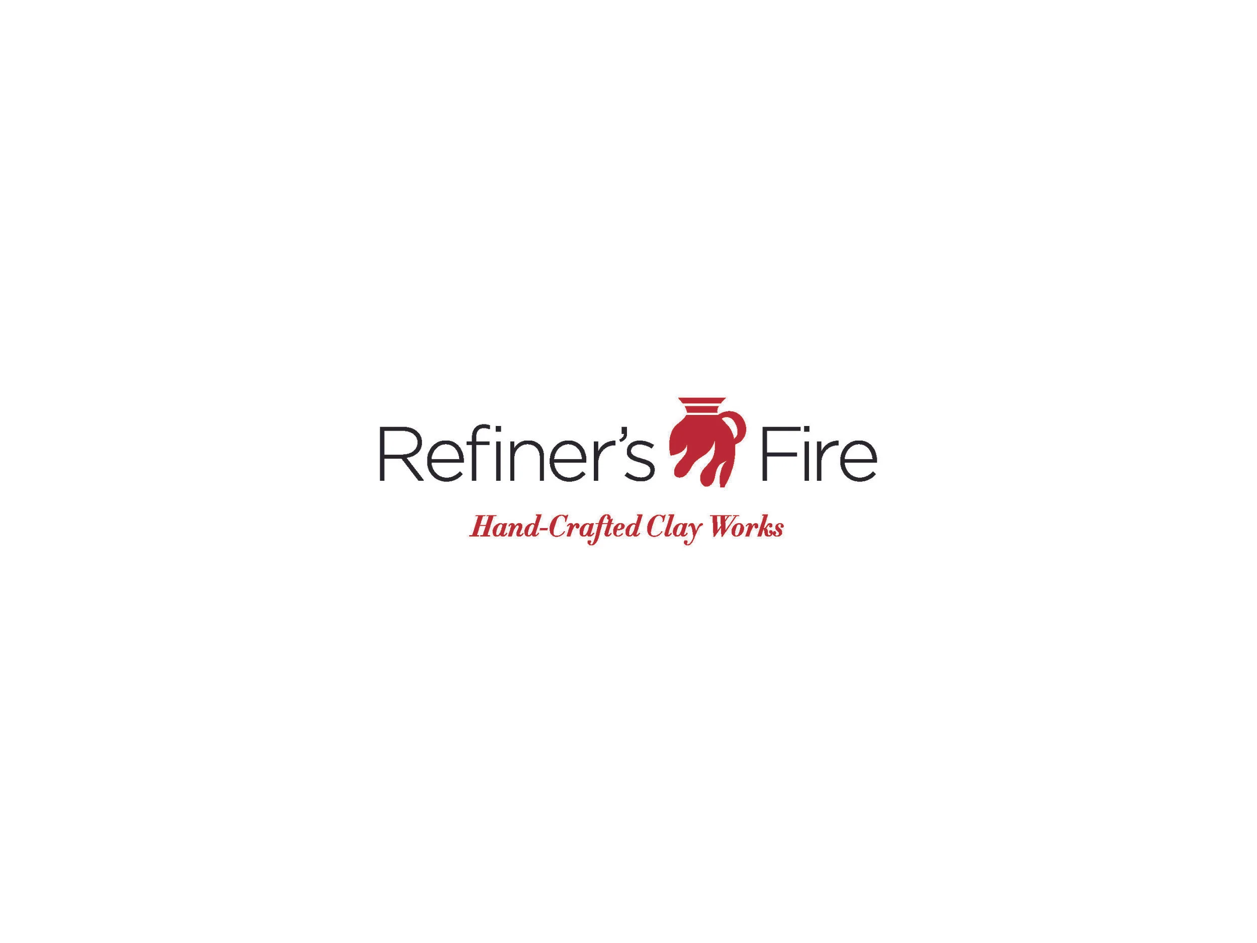
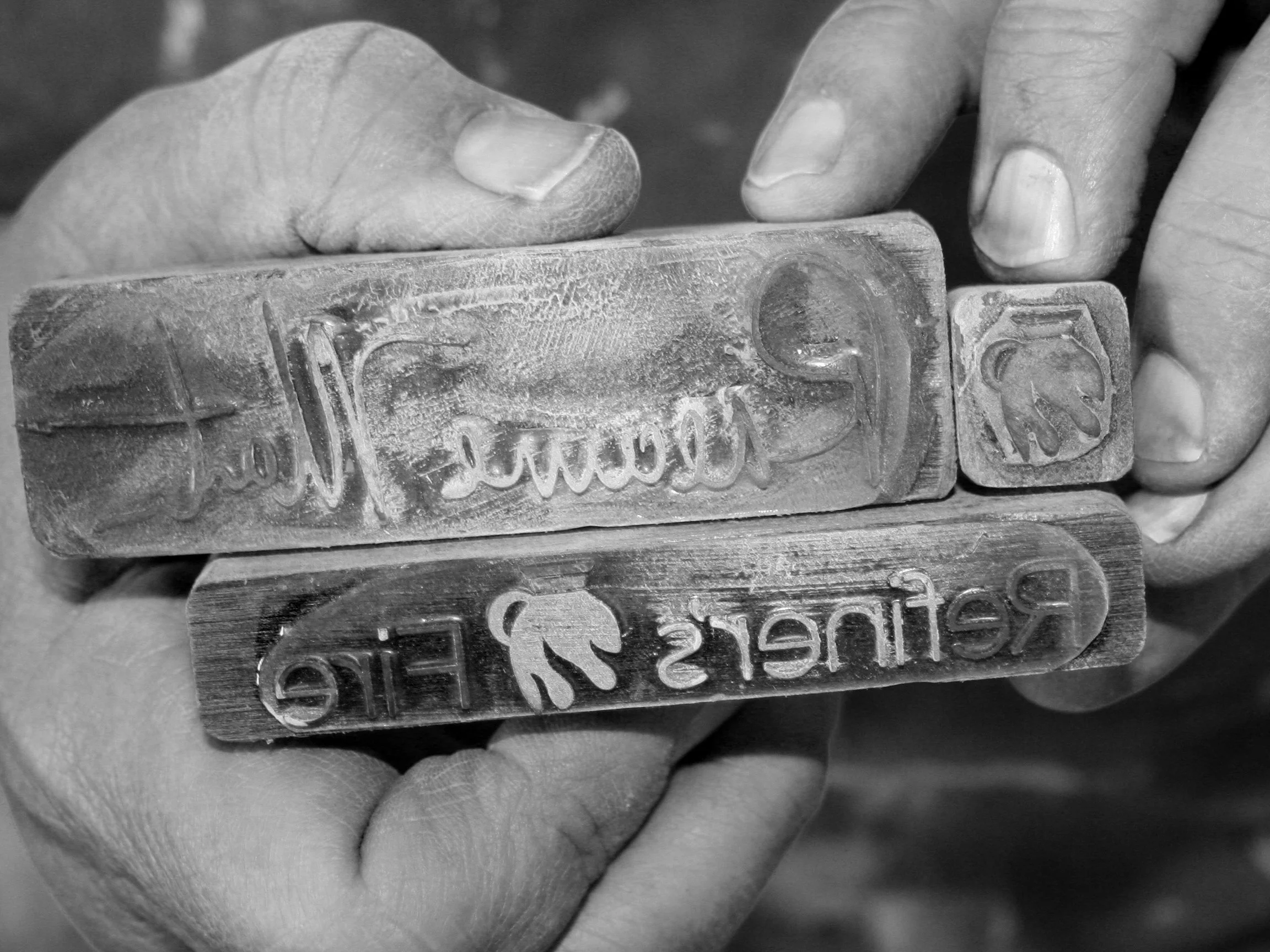
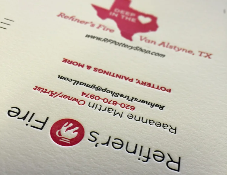
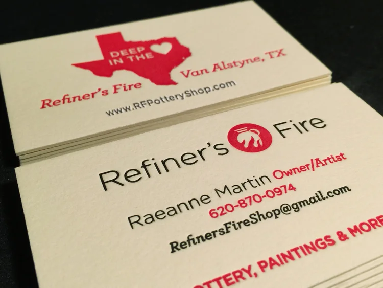
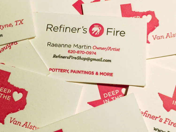
The Refiner's Fire pottery mark started as a simple stamp design for my mother's pottery company, but as her work evolved and her studio has taken on more projects, I've been privileged to be able to work on more identity materials for her.
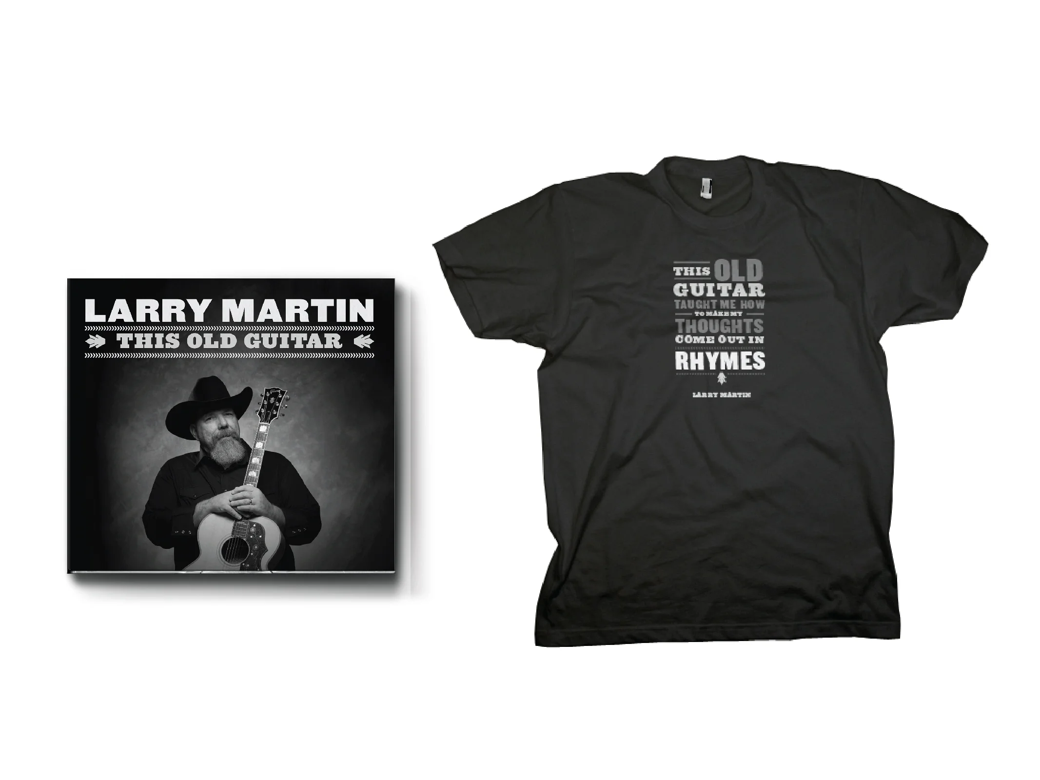
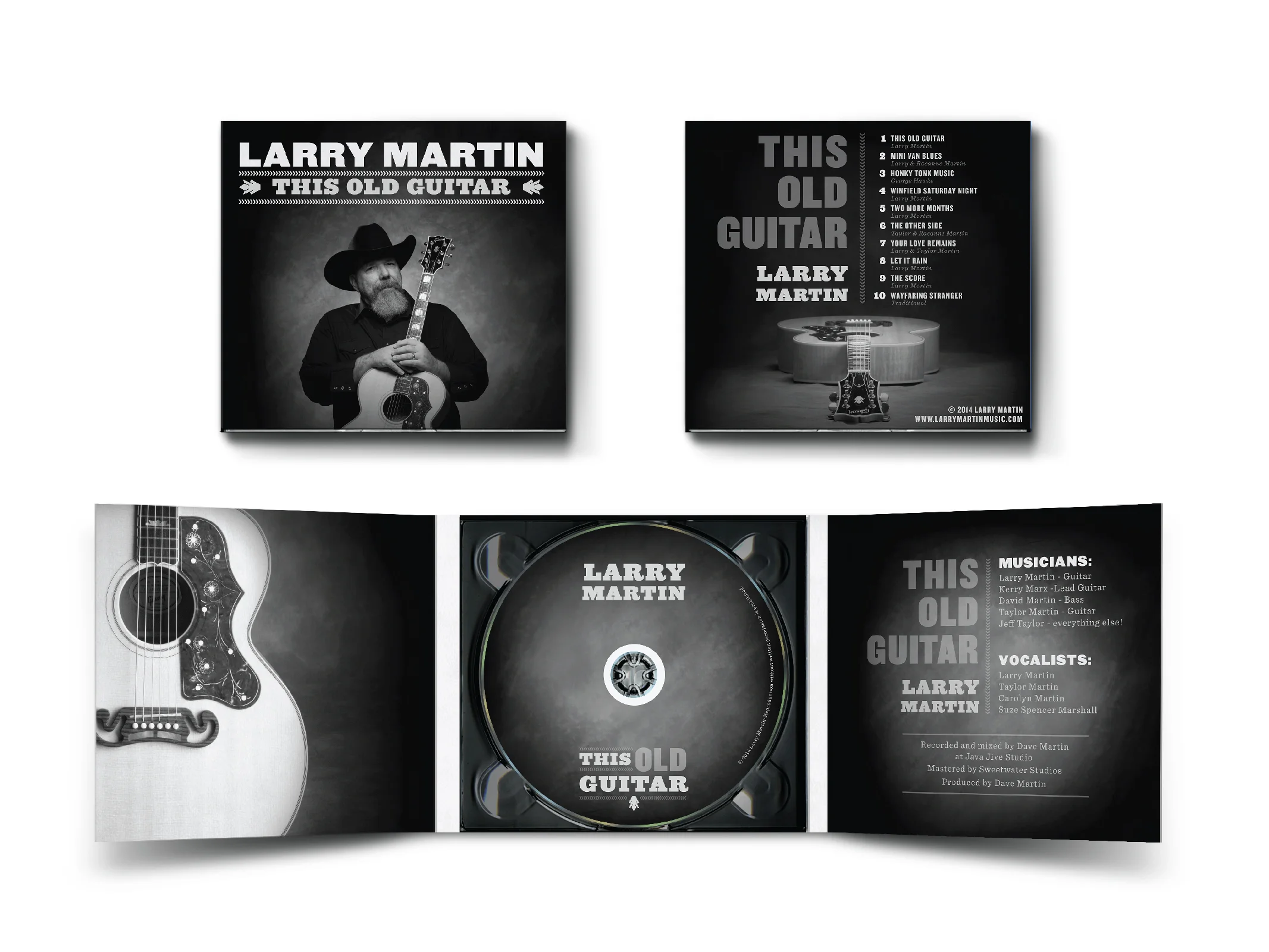
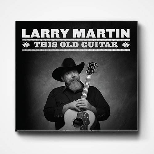
My parents have helped me out a lot in life, and I was delighted to get the chance to get to help my dad out by designing the packaging for his latest album.
I also had the privilege of playing a guitar and singing a bit on this album.
Photography by Steve Brown Photo.